Thursday, September 15, 2011

Rant Review: Batwoman #1, Frankenstein: Agent of SHADE #1, Green Lantern #1, Suicide Squad #1, Grifter #1, and Mister Terrific #1

We've got six more comics to cover today, including two of the ones I was looking forward to the most. Here we go!

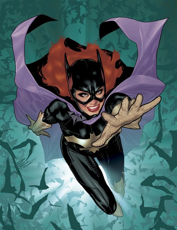
Batwoman #1
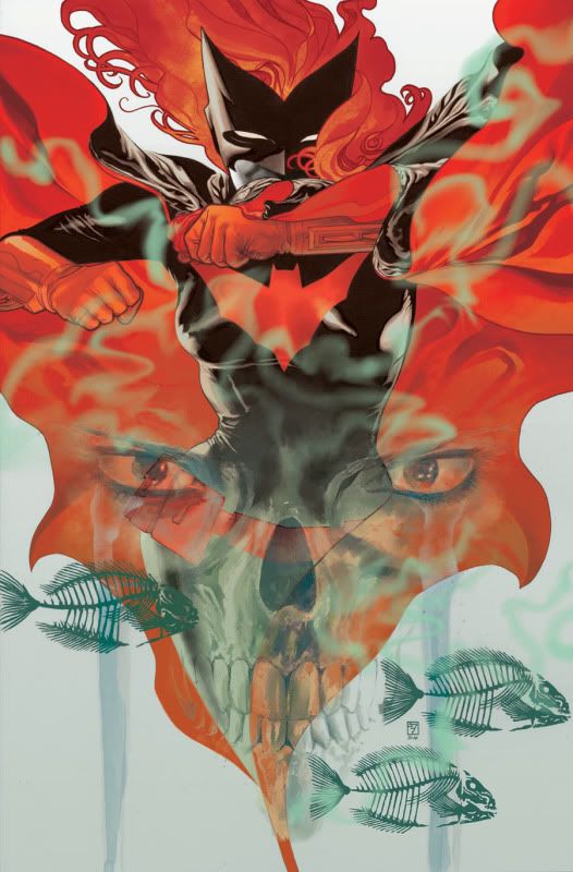
This one has been a looong time coming. The Batwoman ongoing series follows directly in the footsteps of her adventures from her starring stint in Detective Comics a couple of years ago. (If you haven't read the wonderful Elegy yet, what the hell are you waiting for? Go do that NOW!) This ongoing series has been delayed several times-- the #0 issue, which serves as a prelude, came out in November-- and it was finally rescheduled to debut as part of the New 52. The anticipation has been mounting, and this comic meets it all the way. J. H. Williams III (co-writer and artist) and W. Hayden Blackman (co-writer) have done an outstanding job on this issue, on the level of the work Williams did previously on this character with writer Greg Rucka. Batwoman is investigating an apparently supernatural nemesis who is snatching children, as well as training her cousin-- the former Teen Titan Flamebird-- as her protege. There is a bit of recapping woven into the story to help new readers. The book is gorgeous, which is no surprise with Williams supplying the art. He is easily one of the finest artists in the medium, and Batwoman has gotta be the best-looking book you'll find this month. It's action-packed, and at the same time, beautiful and haunting.  
My score: 

  
Suicide Squad #1
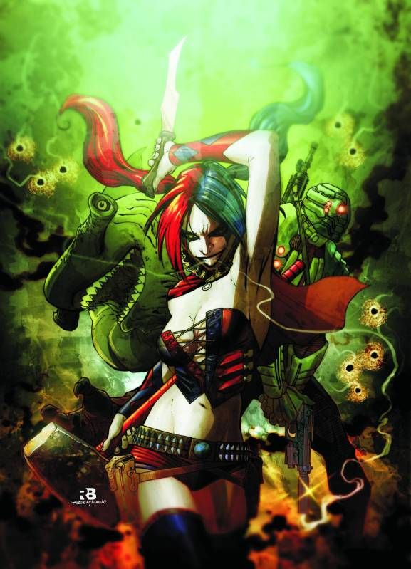
This is one of the more hotly-debated of the relaunch titles, based on a few factors: 1. Since it features several of the same characters, it's been assumed that the beloved Secret Six was cancelled to make way for this series. 2. The costume redesigns have not been poular, particularly the skanked-up Harley Quinn. 3. Writer Adam Glass also wrote the Flashpoint: Legion of Doom series, which was thoroughly lousy. Fortunately, this book is a good deal better than many people were expecting. It's nowhere near good enough to make me stop wshing we had gotten a  relaunched Secret Six title in its place, but it's far, far better than that FP: LOD series.
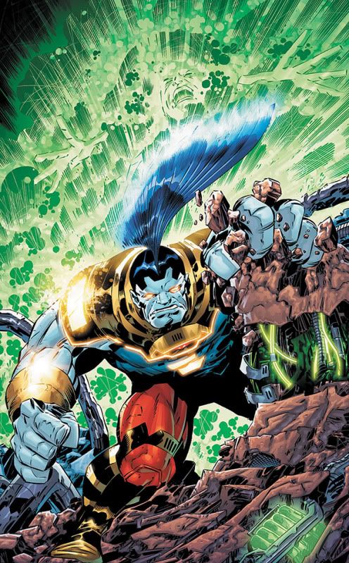
 The plot shows the team undergoing torture at the hands of an unidentified group, which gives the opportunity for some character-establishing flashbacks to familiarize us a bit with the team. Deadshot is the cocky badass he should be, Harley is the unbalanced lunatic we expect her to be, and King Shark is, uh, hungry. A new El Diablo, Black Spider, and the elctrically-powered Voltaic round out the team. The ending of the issue is on the predictable side, but it's not bad at all, and serves as a fitting framework for introducing the cast to us. That's one of the most important things a first issue is supposed to do.
Federico Dallochio's art is quite nice, and suits the tone of the comic very well. He presents a far more attractive, Angela Bassett-esque Amanda Waller than we're used to seeing, but I suspect that was an editorial edict. Many, many people have been expecting this series to be terrible-- I didn't have high hopes for it myself-- and while it's not outstanding, it's pretty good. It's not in my top three for the week, but if you feel like sampling some of these new series beyond the absolute top few, then I would recommend it.  
My score:

Green Lantern #1
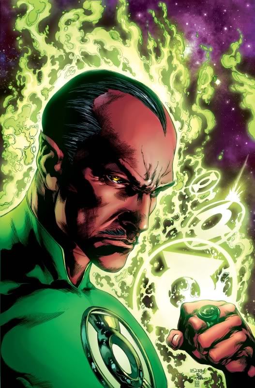
Picking up right where this summer's War of the Green Lanterns storyline left off, Sinestro is now a Green Lantern again, and Hal Jordan, he of the cardboard personality, has been stripped of his ring and left to pick up the pieces of his life on earth. The issue of Sinestro running around with a GL ring is addressed, as well as the reception that's likely to get him among his former underlings in the Sinestro Corps(time for that bunch to get a new name, apparently). Meanwhile, Hal makes an absolute mess of things at home. The biggest problem with this issue is that it spends far too much time on the mundane business of Hal bungling his personal life, when I (and I suspect the vast majority of readers) am far more interested in what Sinestro is up to. Sinestro is now the titular Green Lantern, so having fully half the issue focus on former GL Hal just feels wrong.
That aside, the issue is still quite enjoyable, and that is thanks in no small part to the always wonderful art of Doung Mahnke and inker Christian Alamy. Every panel looks nice, but the art really shines in the scenes set on Oa or in space. (Doug Mahnke was born to draw monsters and zombies, I tell ya!) The new status quo is quite intriguing, and promises to get even more so from here. I've been sticking with this series for years now, and it's giving me no reasons to go anywhere just yet.  
My score:

Frankenstein: Agent of SHADE #1
This is one of the new titles I was most looking forward to. When Grant Morrison introduced this version of the Frankenstein Monster as part of his Seven Soldiers event several years ago, I kept hoping someone would come along and give that wonderful character his own series, maybe even Morrison himself. Well, it took a few years, but it's finally happened. Jeff Lemire has already proven himself worthy of writing the further adventures of Frankenstein with the Flashpoint: Frankenstein and the Creatures of the Unknown miniseries. I'm pleased to see several of the interesting characters he created for that series popping up in this one as well, now that we're back in the "real" DCU. Frankenstein is sent into a warzone in which giant flesh-eating beasts have overrun an entire town, and the Bride has already disappeared as she was nearing the source of the monsters. Frankenstein is joined by his new field team: Dr. Nina Mazursky, a Gill Man-esque amphibious woman, Warren Griffith, a werewolf, Vincent Velcoro, a nosferatu-esque vampire creature, and Khalis, a cool mummy. This issue is packed with cool stuff, from the Ant Farm, SHADE's very swank HQ, to the titular monster himself. Alberto Ponticelli's art works well for the book, and his style reminds me of Guy Daivs. That ain't bad at all, especially for a monster comic. (Although the thought of cover artist J. G. Jones doing the interiors for this book does make me drool...) In a week of comics that is even stronger than last week, Frankenstein is already shaping up to be one of the new 52's best. I just hope this fun new series doesn't get lost in the shuffle among some of the higher-profile books.  
My score: 
Grifter #1
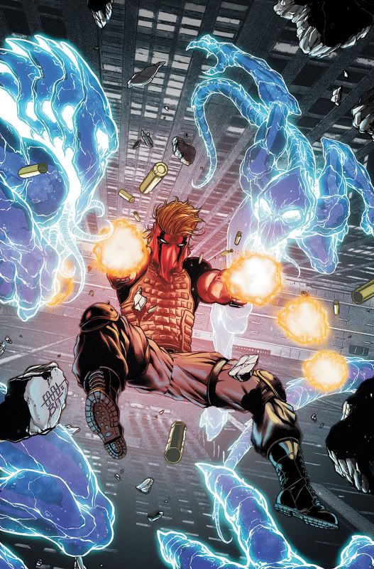
Another Wildstorm character is integrated into the DCU with this series. I know virtually nothing about Grifter, other than the fact that he does what his name implies. Alas, my hopes for a hobo protagonist who travels from town to town, bindle over his shoulder, conning people out of enough money to make the next town, were dashed. What we have instead is a super-powered version of They Live. It's not half bad. Writer Nathan Edmondson thrusts us right into the action, as Grifter gets into a fight on an airplane with two creatures who look like normal people to everyone else. Branded a murderer, he is wanted by the authorities for killing the violent homicidal monsters that only he can detect. A more interesting scenariogo unaddressed: is this really happening, or he insane? Since this is a superhero comic, I'm sure it'll be the former, but the latter possiblity would make for some damn interesting comics.
Cafu's art is very nice, and the brief looks we get of the monstrous antagonists are suitably cool and creepy. Wth a decent story that has a nice hook and some very nice art, Grifter emerges as a solid middle-of-the-pack book.   
My score:
Mister Terrific #1
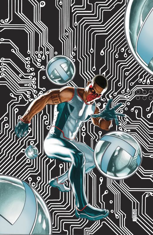
Mister Terrific finally gets his own ongoing series with one caveat: all his history with the Justice Society? It's gone, baby. Fortunately, the character emerges pretty much unscathed. It's a shame to lose his history with the JSA, but those stories are still there if you want to read them(and I'm one of the people who will be revisiting them, there was some great stuff in that series). In a very efficient debut issue, writer Eric Wallace gives us a quick action scene, Mr. Terrific's origin, introduces us to Mr.Terrific's very cool HQ, and sets up a new villain and the threat against Michael himself for the next issue. Wallace also puts Michael's supporting cast in place, including the familiar face of Karen Starr, who sadly, is apparently no longer the superpowered Power Girl. (The issue does not come right out and say for certain, but there is one scene in the comic where she surely would have been flying into action if she were capable of doing so.) Despite all that, it never feels as if the reader is being info-dumped on. Very efficient use of those twenty pages!
The art by Gianluca Gugliotta and Wayne Faucher is pretty good for the most part, aside from one odd panel where it looks like Michael has the hindquarters of a horse-- seriously, check out page 9!-- and a few spots here and there where some characters' faces come off a little soft and melty. Those few hiccups aside, the book looks pretty nice.
This is another of those series where I really did not know what to expect. I am unfamiliar with the work of Eric Wallace, and didn't really have anything on which to base my expectations. I've always liked Mr. Terrific though, so I hoped for the best. Thankfully, this is a fun debut issue, and if it can keep to this level of quality, I can see it becoming one of my favorite ongong series.  
My score:

Overall, I feel that this was a stronger week for the DC relaunch than last week. Considering we had Action Comics, Swamp Thing, and Animal Man last week, thats saying something! The quality across the line seemed a bit higher this week, with no real stinkers at all, as opposed to last week's Green Arrow and Hawk and Dove. Hopefully next week will be even better! We'll be looking at the debut issues of Batman, Birds of Prey, Catwoman, Green Lantern Corps, Nightwing, Wonder Woman, and more! Be sure to come by and check it out!

Wednesday, September 14, 2011

Rant Review: Batman & Robin #1, Demon Knights #1, Deathstroke #1, Red Lanterns #1, Resurrection Man #1, Legion Lost #1, Superboy #1

Here's the first batch of this week's DC relunch comics; check back tomorrow for the rest! Let's hit it!

 Batman & Robin #1
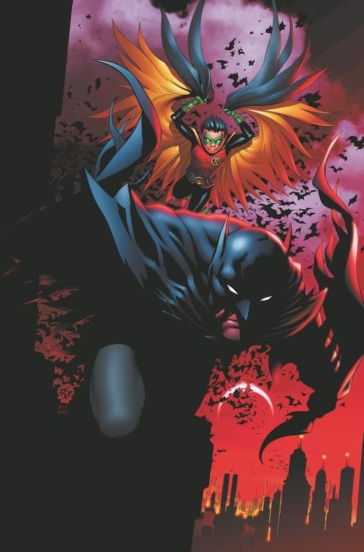
Peter Tomasi and Patrick Gleason return to this fan-favorite series in time for the relaunch. Now that Dick Grayson is back to being Nightwing, Bruce Wayne is the titular Batman, and we get to see him actually work with his son Damian, the current Robin, for the first time. It's rather jarring for both of them. Where Damian and Dick had developed a mutual respect for one another over time, Damian is having to earn his father's trust here. He's learning that working with his father is quite different from working with Dick. While I wish Dck had continued to be the Batman of Gotham while Bruce tended to his globetrotting team-building in Batman Inc, I understand the reasoning behind returning to a single Batman with the relaunch. If the interplay between Bruce and his son continues to be protrayed as well as it is in this issue, that will go a long way toward making up for the change.
This issue is very well-paced, and a lot happens within its 20 pages. We get a glimpse of Moscow's Batman Inc. operative, Dick takes Damian along to visit spot in Crime Alley where Batman was born, and the duo foil a plan to cause a nuclear meltdown. Tomasi is one of the few writers who seems to "get" Damian, and the developing relationship between he and his father remains very interesting. Gleason's art is very nice, as we've come to expect. This is one of the best-looking books out there. There is no shortage of Batman books to choose from, but this one definitely deserves to be on the shortlist for those who only want to follow one or two of them.  
My score:

Demon Knights #1
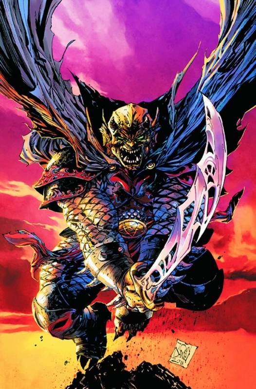
As part of DC's "The Dark" line, this was one of the new titles that had most piqued my interest. Writer Paul Cornell  was part of the reason, as I've enjoyed his work in the past, but one of the biggest attractions was definitely the eclectic cast of characters. With a cast including the demon Etrigan, Madame Xanadu, Shining Knight, and Vandal Savage, things promise to be very interesting indeed. We don't quite see them all come together in this debut issue, but there is plenty to get readers hooked. Beginning with the fall of Camelot, we see how Etrigan was bound to Jason Blood in the first place. From there, the story moves to the dark ages, where a wicked queen is ravaging the countryside in pursuit of some unnamed goal. She is aided by a familiar face. The art by Diogenes Neves and Oclair Albert pretty good, but comes off rather stiff in places. The style suits the tone of the story though, as well as the era in which it takes place. This was a fun issue, and I'll definitely be returning for more next month.  
My score:

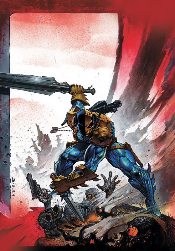
Deathstroke #1
This was one of the DC relaunch series for which I had no expectations. I'm unfamiliar with writer Kyle Higgins, and a book about a merciless assassin could be very good or very bad, depending on the ability of the writer. This book is somewhere in between. Higgins wastes no time throwing us into the action, and things move briskly. There are a few plot twists along the way, and one mystery left dangling for future issues. The result is an energetic issue that entertains, but little of it sticks. The art by Joe Bennet and Art Thibert is above average; Bennet has proven himself a solid artist in the past, and Thibert's inks work well with his pencils. This is not the best of the new 52 so far, but it's far from the worst.  
My score:

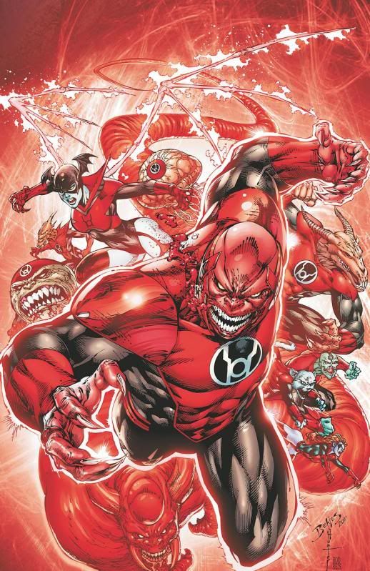
Red Lanterns #1
Atrocitus and his Red Lantern Corps has become one of the most popular groups of the expanded color spectrum ring-slingers; it was a matter of time before one of these groups got their own series, and the RLC is an obvious choice. Writer Peter Milligan usually does good work;  every so often he drops a duke with his scripts, but I can honestly say that I've enjoyed the vast majority of his work. Fortunately, he seems primed to do good stuff with this title. The fires of Atrocitus's rage seem to be ebbing, and rest of the RLC senses this. Atrocitus finds a new focus for his rage, but it may be too late, as dissension is already spreading throughout the RLC. The art by Ed Benes is, well, art by Ed Benes. If you're not a fan-- personally, I'm not-- there is nothing in this issue that will change your mind. Fortunately, most of the issue calls for Benes to draw weird aliens and monsters, which masks a lot of the deficiencies in his art. They come roaring back when actual humans appear, but that's only for a few pages.  There is nothing spectacularly good in this issue, but it lays a solid foundation for issue 2 to build on.  
My score: 

Resurrection Man #1
The beloved series from the ate '90s returns, written by its original wrting team of Dan Abnett and Andy Lanning(affectionately referred to as DnA). Mitch Shelley resurrects every time he dies, and returns with a different superpower each time. The forces of the afrerlife have finally taken notice, and supernatural agents are hunting him down, each hoping to claim his bright, shiny soul. It's a great premise with loads of possibilities. the angle that appears in this issue is on the creepy side, so just imagine what the demons are going to look like! Fernando Dagnino's art is nice and solid, with just the right touch of murkiness this book needs. This book doesn't hit the highs of last week's Swamp Thing and Animal Man, but it's pretty damn interesting.  
My score:

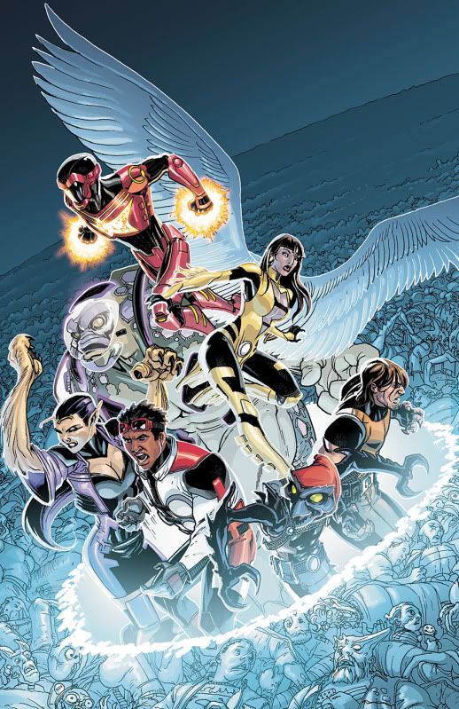
Legion Lost #1
Speaking as someone who is unfamiliar with this cast of characters, this issue can be slightly overwhelming. There's a cast of more than half a dozen, but writer Fabian Nicieza does make sure we get all their names and most of them get a moment to gives us a taste of their personality and powers. The time-stranded heroes quickly discover that their tech is not working properly in our time, and the pollutants in the atmosphere are having an adverse effect on some of them. They quickly capture the villain they were pursuing, and that's when the real trouble begins. Some unspecified pathogen has been released that threatens to erase the future, and it seems our heroes will be trying to contain it while they are stranded here. Pete Woods's art is very nice, as always. This comic is fast-paced and action-packed, and the cast seems to be a pretty good mix of power sets and personalities. The issue didn't "wow" me, but it was interesting enough that I'll be back next month. 
My score:   


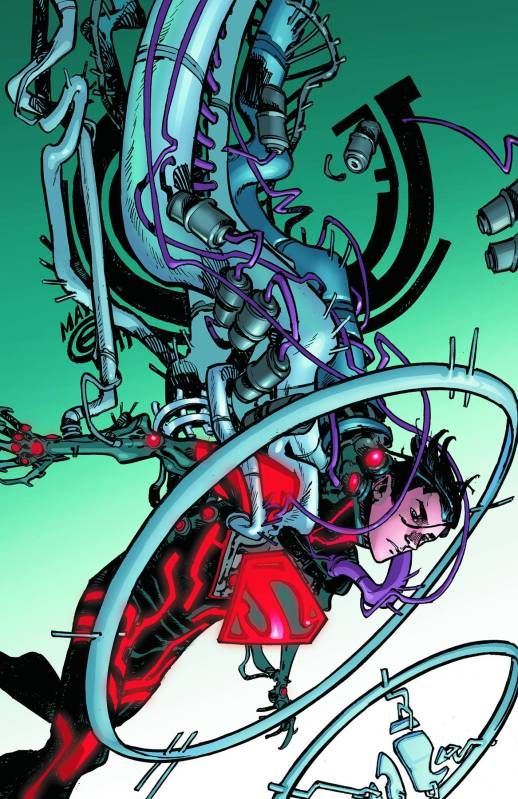
Superboy #1
This title has an uphill struggle ahead of it, as it replaces the Jeff Lemire-penned Superboy series that had quickly become a beloved fan-favorite. There's even a sly shout-out to that series in this issue, so the team is clearly aware that they'll be facing that comparison. Scott Lobdell does a pretty good job with this issue, giving us a character that is a bit closer to the original conception of the Conner Kent version of Superboy. the end of the issue dovetails nicely into the soon-to-be-released Teen Titans #1.  The art team of R. B. Silva and Rob Lean deliver work that is serviceable, and not much more than that. Still, it's not a bad-looking book; it just looks sort of... okay. This is definitely not in the upper echelon of DC relaunch books, but it's a decent debut for those of you who are curious and want to check it out.  
My score: 
 
That's it for today! Drop in tomorrow, when we'll be looking at Batwoman #1, Frankenstein: Agent of SHADE #1, Green Lantern #1, Suicide Sqaud #1, Grifter #1, and Mister Terrific #1!

Thursday, September 8, 2011

Rant Review: Detective Comics #1, Animal Man #1, Swamp Thing #1, Batwing #1, Static Shock #1, Green Arrow #1, Hawk & Dove #1

Here I am with the rest of this week's DC New 52 books for this week; let's hit it!


Detective Comics #1
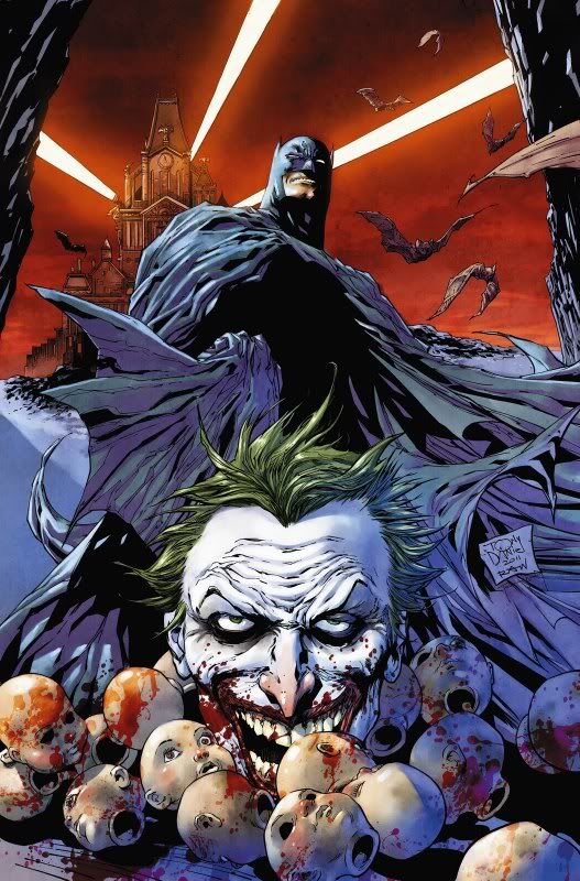
There has been a good deal of griping about tony Daniel's tenure on the Batman books. Batman has been (mostly) in his hands for the past year and a half,  and while I felt the run was decent, others have abhorred it. (Personally, even though I felt his work was decent, I don't feel that "decent" is good enough for one of the flagship titles of the entire comics industry.) When it was announced that Daniel was moving to Detective Comics as part of the DC relaunch, fandom predictably blew a gasket over it. However, the relaunch is a fresh start, so I'm entirely willing to give Daniel a fair shot at impressing me. Did he pull it off?
Well, not quite. Don't get me wrong, this is not a bad comic. The art is quite nice, aside form a few awkward panels. Daniel is turning in the best art of his career in this issue. It's clear that he relishes drawing all the details in the tweaked Batman costume, and he even manages to channel some past masters (perhaps most notably Frank Miller) on a few pages. Visually, this is a very nice book.
The story is where things decline quite a bit. It's really not bad, but it's not great either, and the often awkward dialogue drags it back down to the level of-- say it with me-- merely decent. However, the final plot development at the end of the issue is a definite hook to get you ready for the next issue. It's a solid beginning for a run that will hopefully improve from here. If not, we'll still have Scott Snyder's Batman...  
My score:


Animal Man #1
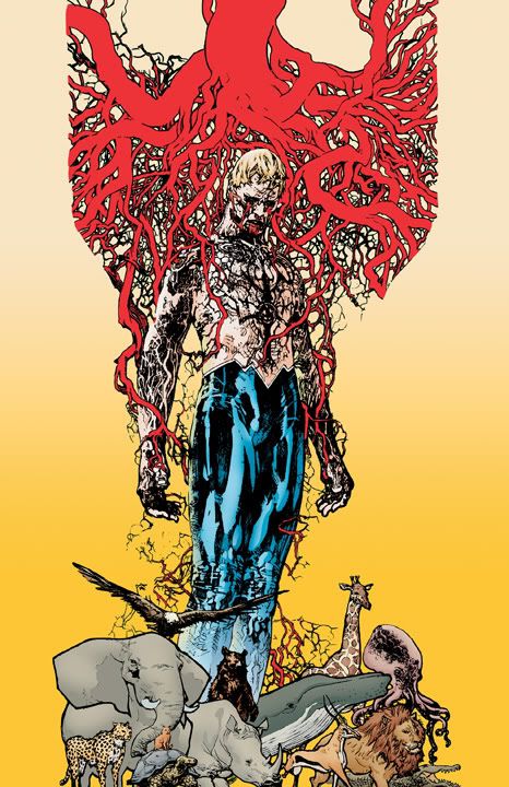
Straight from the D-list comes Animal Man! Nearly unique among superheroes, Animal Man is a family man, witha  wife and kids. He is also one of the toughest characters for writers to get a handle on, and his greatest success to date was in the hands of Grant Morrison in his amazing run two decades ago.  That remains the dominany version of the character in the minds of comic readers, and Jeff Lemire wisely uses that as his starting point here. The book begins with a text piece from an interview Buddy has recently given, which succinctly sums up the character for readers who are unfamiliar with him. From there, Lemire weaves a tale that begins as a charming domestic portrait of the Baker family, then quickly turns into a superhero adventure that shows how powerful Animal Man really is. From there, things get creepy. Travel Foreman's art is very appropriate for the story, and truly enhances it. The overal package could serve as a textbook example of how to do a first issue of a comic series properly.  


My score: 


Swamp Thing #1
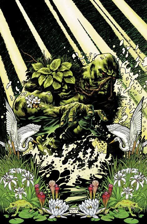
Swamp Thing has long been denied the DCU, as his comic series have been confined to DC's Vertigo imprint for the past 15 years or so.  The year-long Brightest-Day series returned him to the DCU earlier this year, however, and here we are. Scott Snyder picks thingws up where they left off, and mayhem ensues. Snyder gives Alec Holland a very distnct and realistic "voice," and handles Superman expertly, as well. Yanick Paquette's art is excellent, and we are treated to some truly inventive and dynamic page layouts. Paquette has been one of the better artists working in the comics field for quite a while now, but his work in this issue is easily thes best work I've ever seen from him. I really can't overstate how gorgeous this book is. The team also treats us to a few shout-outs to Swamp Thing's history. This is an intriguing debut issue, and I'm very excited to see where this team takes these characters next.


My score:

  
 Hawk & Dove #1
 Whew. This was not an easy one to get through. The story is nothing special; Sterling Gates delivers a standard setup for a superhero series. We're introduced to the characters and given the lowdown on what their abilities are, and we witness some action where they get to show off some of those abilities. Hawk is such a thoroughly unlikeable character that it's hard to be interested in him. There are no redeeming qualities to him, and nothing to add any additional interest; he's just a generic muscle-bound asshole. Still, for all of that, the plot of this comic is readable, and not really bad. What really kills it is the "art."
You've surely noticed that I did not post any cover art for this comic. This is for your protection. See, this comic was "drawn" by alleged artist Rob Liefeld. click the link and check out some of what awaits you, I'll wait.
Back so soon? I understand, I can't stand to look at much of it for once, either.  I honestly don't want to turn this into a Liefeld bash-fest; that's been done to death. It's just important to get the point across that the man's work has not improved the slightest bit; the "art" in this comic is no better than what you just looked at. And someone at DC thought he needed to be hired to provide the art for one of their high-profile relaunch titles. Just think about that, and despair. Now, I'll say nothing more about it.
A strong story can often make up for poor art, but unfortunately, we don't get a strong story here. We have a story that is adequate at best, and while some nice art could have buoyed the story enough to make this comic a decent piece of entertainment, what we wind up with is a complete waste of money and time.
Oh, and this comic is one of the titles that has already sold out. Evidently, the crowd who digs "Jersey Shore" has been lured into comic stores.
My score:


Batwing #1
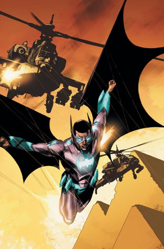
Grant Morrison has introduced quite a few intriguing new characters in his excellent Batman Inc. series over the past year, and it's high time one of them got an ongoing series. Hence, Batwing. Batman's deputized operative in Africa. Writer Judd Winick is really hit-or-miss; fortunately, this one looks like a hit. This issue covers all the bases it needs to to introduce us to the character and his world, and does so with grace and economy. The art by Ben Oliver, enhanced by Carlos Mangual's colors, give the book a nice, realistic look that suits the somber story that is being unfolded. The idea of getting to see a Batman-sanctioned vigilante operating in such a rarely-used and exotic locale as this really appeals to me, and I hope to see the concept exploited to the fullest in the issues to come. For now, we're off to a good start.


My score:   


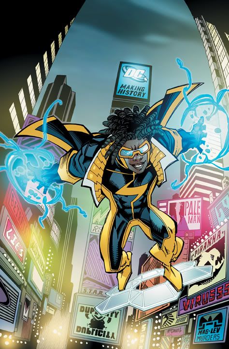
Static Shock #1
 I admit it: I have never read any of the comics from the Milestone line. I on;y know Static from his animated series appearances and the guest spots he's had in some DCU comics in the last few years. That aside, I do like the character based on my limited knowledge of him. Hence, this was not one of my most anticipated new titles, but I was looking forward to getting a chance at a new Static series.
Co-writers Scott McDaniel and John Rozum  do a pretty good job here, giving us the requisite introductions to the main character and his supporting cast, and a peek at his rogues gallery. Historically, the DCU has not featured that many titles that are set in New York City, and we already have two launching this month(the other is Hawkman). The location gives the book a look that is slightly different in the DCU, given that we're so accustomed to fictional cities such as Gotham, Opal, and Metropolis. The city and its denizens are rendered by artist McDaniel in his usual dynamic style; the pages practically burst with energy. Jonathan Glapion and Le Beau Underwood's inks don't mesh qith McDaniel's pencils quite as well as some inkers he has been paired with in the past-- John Beatty springs instantly to mind-- but they are more than adequate. Static Shock is a nice-looking book that gives us a decent story and a nice cliffhanger; it's not the best comic DC released this week, but it's good enough that I'm interested in reading the next issue.
My score: 


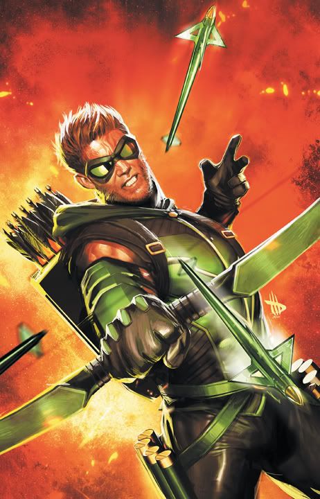
Green Arrow #1 
I gotta admit, writer J. T. Krul has not endeared himself to me in the past. I've tried reading several series he has written, and have found them all to be invariably bad. Still, I resolved to give him one more chance with the launch of this new Green Arrow series.  
I really should listen to my gut more often.
I hate to put it so bluntly, but this is a bad comic.  A couple of the DC relaunch titles I've read yesterday and today have had stories that were just adequate, but this one is not even on that level. I'm genuinely annoyed with myself for wasting 7 minutes reading this comic. The art does little to mitigate things. Dan Jurgens is a decent artist, but his best days as an artist seem to be behind him. His art is increasingly stiff these days, and George Perez pairs nicely with him as an inker, but that stiffness still shines through. The action scenes, in particular, fare poorly because of this. The art is not bad, but it's not a selling point, either.
I don't want this to turn into a bashfest, so I'll put it this way: if you've never liked any of Krul's stuff in the past, you won't like this either. Leave this one on the shelf; don't waste your time or money.  
My score: 

It kinda sucks to end this week's reviews on such a sour note, but that's the way it goes sometimes. Swing back by next week, when we'll be looking at the new first issues of Batman & Robin, Frankenstein: Agent of SHADE, Batwoman, Green Lantern, Demon Knights, Mister Terrific, Red Lanterns, and more!

Wednesday, September 7, 2011

Rant Review: Action Comics #1, JLI #1, Stormwatch #1, Batgirl #1, Men of War #1, OMAC #1

We've got thirteen first issues to look at this week, so I'll be splitting 'em up. Look for part two tomorrow!


Action Comics #1

Comics god Grant Morrison and artist Rags Morales' relaunch of the series that gave the world its first superhero has been one of the most hotly anticipated titels of the DC relaunch. I'm happy to say that it completely lives up to the hype.
I'll start by employing a cliche: This ain't your father's Superman. No, it's your grandfather's Superman, the original, less-powerful, social activist, wonderfully filtered through the mind of Morrison. The title is not a misnomer, as action abounds in this issue; in typical Morrison fashion, there is a lot more going on if you look a little deeper. More than any other writer working today, Morrison's comics grow better and better the more you re-read.
With Morales handling the art, the book is obviously gorgeous. One of the best and most underrated artists working today, Morales' style is realistic, but with a slightly cartoonish edge that is ideally suited for a modern Superman story. His characters have real "weight," and his page layouts are impeccable. I can hardly think of another artist who would be as good a match for this series.
Action Comics #1 gives us everything we want in a Superman comic, and more. There is even a nice reference to the very first Superman story, way back in the original Action Comics #1. If you only get one comic this week, make it this one.
My score:


Justice League International #1
(Note: the cover image to the left is the one originally shown when this title was announced. For whatever reason, the woman in black was removed, then replaced by Godiva on the final cover.)
The JLI finally returns, months after being set up in the Justice League: Generation Lost series that wrapped up in April. The lineup for the team promises to be interesting, with a good mix of characters you'd expect in a JLI comic, and a few wild cards tossed in for good measure. With a roster made up of Batman, Booster Gold, Vixen, Green Lantern Guy Gardner, Japan's August General in Iron, Russia's Rocket Red, Sweden's Ice, and Britain's Godiva, some sparks are bound to fly. We get a taste of that in this issue.
Unlike last week's Justice League #1, no time is spent slowly getting the characters into position. The team is quickly formed, then embarks on its first mission. Aaron Lopresti's art is adequate; his style is not too flashy or spectacular, but his layouts are solid, and the art is more than serviceable. (I feel it must be said, however, that Booster's new costume is a perfect example of a needless redesign that does not improve on the old design the slightest bit. I tend to like a lot of the new costues, but this is not one of them.) Writer Dan Jurgens is certainly familiar with most of these characters, having handled several of them for extended runs on various titles in the past. Jurgens turns in a story that is pretty much what I expected, given his track record: nice and solid, but unremarkable. That may sound like a backhanded compliment, but I don't mean to slight his work here; JLI is a good, solid superhero comic that holds your interest, and promises more to come. Several subplots have already been set rolling, and things are sure to get only more interesting in subsequent issues.
My score: 


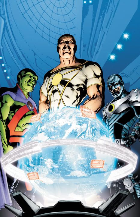
Stormwatch #1
We move now to a very different team series. Writer Paul Cornell brings this Wildstorm series into the DCU, and the results are definitely interesting. Cornell certainly sets a brisk pace; in this issue alone, we see the moon preparing to attack the earth(yes, you read that right), a gigantic spiky worm-thing is discovered in the arctic, and Martian Manhunter and friends attempt to recruit the superpowered vigilante Apollo into their ranks. Crnell does a good job giving us a sense of who each of these characters are; I am unfamiliar with the Wildstorm characters, but I feel that I have a pretty good sense of who most of them are after reading this issue. Miguel Sepulveda's art is nize and slick, with a dark edge that fits the story quite well. Each of the characters remains distinct, even theones who are not wearing superhero costumes, something many artists seem to struggle with.
I was looking forward to this series based on my enjoyment of Cornell's past work, and he did not let me down. It's a fun book that is practically bursting with potential, and I can't wait to see what comes next.  
My score:


Batgirl #1
And so we come to one of the most cntroversial of the relaunch titles. Give this a quick read if you're unaware of exactly why, and you'll be up to speed. Personally, I feel that making Barbara Batgirl once again, particularly ince we already have a fairly new Batgirl who has quickly become a fan-favorite, is just regression. That doesn't change the fact that it happened, so putting that aside, I dove into the first issue. Surely, if anyone could make this work, it's Gail simone.
Thankfully, she pulls it off. Simone wisely avoids using any magical or comic-book science deus ex machina to cure Barbara's paralysis. Barbara's former handicap, and the event that caused it,  understandably loom large in her mind. There are a couple of events in the issue that hammer the point home, none more effectively than the moment when Barbara freezes up as a gun is pointed at her, aimed at the same spot where she was shot before.
The art by Ardian Syaf and Vincente Sifuentes is very pleasing to the eyes, detailed and dynamic. Batgirl's new costume design is one of the good ones; overall, the Batman family of characters are best suited for the detailed and layered designs that are becoming increasingly common as part of the DCU relaunch, and Batgirl is no exception. The costume looks functional and practical(as practical as any superhero costume can, anyway).
There were several major hurdles to overcome with this issue, and Simone soars over them deftly. I still don't think this regression was the right move, but the fact is that it is happening, so we must make the best of it. Fortunately, it looks like we'll have a damn good Batgirl comic as a result(even if it is damn odd seeing Jim Gordon in the present day with red hair).
My score:


Men of War #1
This first issue of the modern-day war series shows us how the grandson of the WW2 hero Sergeant Rock becomes a Sgt. in his own right. As part of a mission where the squad encounters an unnamed, and barely seen, super-powered being, things quickly turn bad. There's a bit of characterization, and a lot of action. Writer Ivan Brandon keeps things moving, and and Tom Derenick delivers a solid art job that is enhanced by Matt Wilson's muted color pallette.
In the backup story, Jonathan Vankin and Phil Winslade bring us a tale of Navy SEALS in combat. It's short and sweet, but that's about what you expect in 8 pages. It's billed as "part 1 of 3," and this introductory chapter does a good job of piquing your interest enough that you just might come back for more.
Overall, a solid first issue. This is not one of the titles I was most interested in, but I do enjoy war stories when they're done very weel, and this issue was good enoguh that I'll be checking out the next issue.  
My score:


OMAC #1
Co-written By Keith Giffen and Dan Didio, with art by Giffen, OMAC is one of the true wild cards of the DC relaunch.  OMAC is a character that has been revisited and revamped numerous times over the years, and handful just in the last 5 years alone. However, with Giffen channeling the great Jack Kirby for all he's worth, it was sure to at least be a visually stunning series. It most certainly is that; from cover to cover, the book is a veritable orgy of crazy Kirby-esque goodness. Simpkly put: OMAC's a real purty comic book.
The story is pretty straightforward, but that is by no menas a bad thing. We are thrust directly into the action, and introduced to a bunch of characters in short order. The result is a quick, fun read that lays the groundwork for plenty of futre mayhem. The blurb for the second issue promises that "things get weird;" I'd say we're off to a good start.  
My score:


That's it for today, but be sure to come back tomorrow for the remainder of this week's New 52 books!

Monday, September 5, 2011

The Quest for the Definitive Batman: A Tale of Tragedy and Triumph! (well, kinda)

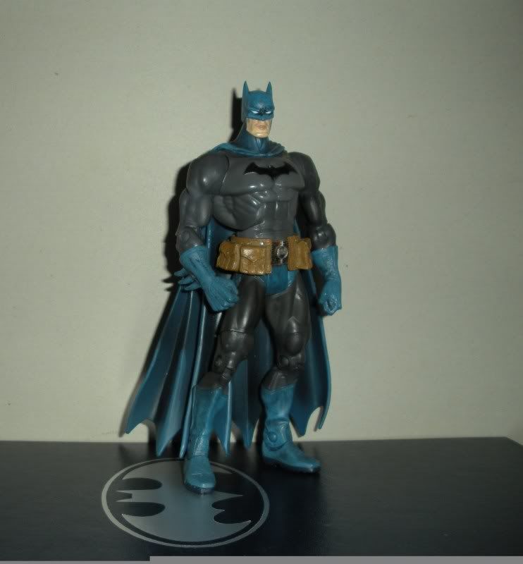
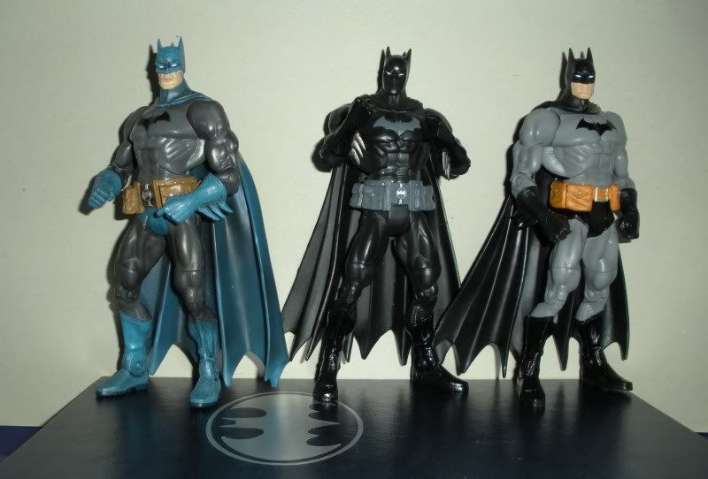
Several years ago, DC license holder Mattel released a Batman action figure. Now, this in itself is not notable; literally dozens of Batman action figures are released every year(and that's in a slow year). But this one was different. The combination of sculpt, articulation, and design made this the greatest Batman action figure produced to date. As part of the DC Superheroes line sculpted by the amazing Four Horsemen, a wonderfully detailed sculpt was a foregone conclusion, but this one took it a bit further than many of their previous superhero figures had. The seams and wrinkles on the costume were sculpted in amazing detail, some of the underlying armor plating was visible on the gloves/gauntlets, there were treads on the bottoms of the boots... I could go on and on. Even better, this figure jived with most of my personal preferences when it comes to Batman's overall appearance: the bat emblem on his chest was lacking the oval, the belt had big pouches instead of the goofy capsules-- seriously, what could he be carrying in those damn capsules anyway?-- but there was just one problem: the costume had a blue and gray color scheme, rather than the preferred black and gray.

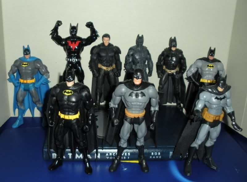
Nitpicking? Possibly, when practically everything else about this action figure was done so well. However, it must be kept in mind that I've gotten quite a few Batman figures over the years; it would not be an exaggerration to crown Batman the king of my action figure-collecting hobby. There have been some great plastic versions of Batman produced, and I've liked quite a few of them, but none have been what I considered my definitive representation of the character. To have one that came so very close to perfection, only to have it fall short because of a color choice was rather disappointing. Still, the figure was too great not to love, and I was confident that repaint-happy Mattel would get around to releasing a black and gray version before long.

I was right about that, but there was a problem I somehow did not take into account: Mattel's uncanny ability to fuck up absolutely anything. Between their solid cases of Superman (sometimes with a couple of Bizarros thrown in for good measure) clogging pegs at retailers everywhere, every major retailer except for K-Mart and Toys R Us dropped the line. Our K-Mart had closed several years earlier, and our local Toys R Us seemed to have major problems with getting new items that were not movie tie-ins, so I never saw this black and gray repaint anywhere. Anywhere, that is, except for online, where its price quickly soared. I wasn't the only one who considered this the greatest Batman figure ever made, and people with a lot more disposable income than I had were willing to pay a premium price for it. (It should be noted that the black and gray version featured a different belt from a slightly earlier Batman figure, as many people complained that the belt from the blue and gray version interfered with the leg articulation. I like both belts just fine, so no problem.)

Things started looking up when Mattel kicked off their DC universe Classics line the following year. Repaints and reissues of figures from the DC Superheroes line were common, and this Batman was a very demanded figure(as evidenced by its price on ebay, which was well over $100), and frequently requested as a reissue. Surely, it was only a matter of time before they got around to reissuing it?

Well, remember that we're talking about Mattel. Scads of Batman figures were released over the course of the next few years, several even had that black and gray color scheme. However, these invariably fell short of the DCSH version in a few ways; they often used the capsule belt, and they usually had the bat emblem with the yellow oval. Even when one was released that had the oval-less bat emblem, it used the standard "large build" DCUC body, not the Batman-specific sculpt with all that wonderful detail. One two-pack included a DCUC Batman repaint, but teased us horribly by showing off the much-demanded DCSH figure in the photo on the package!

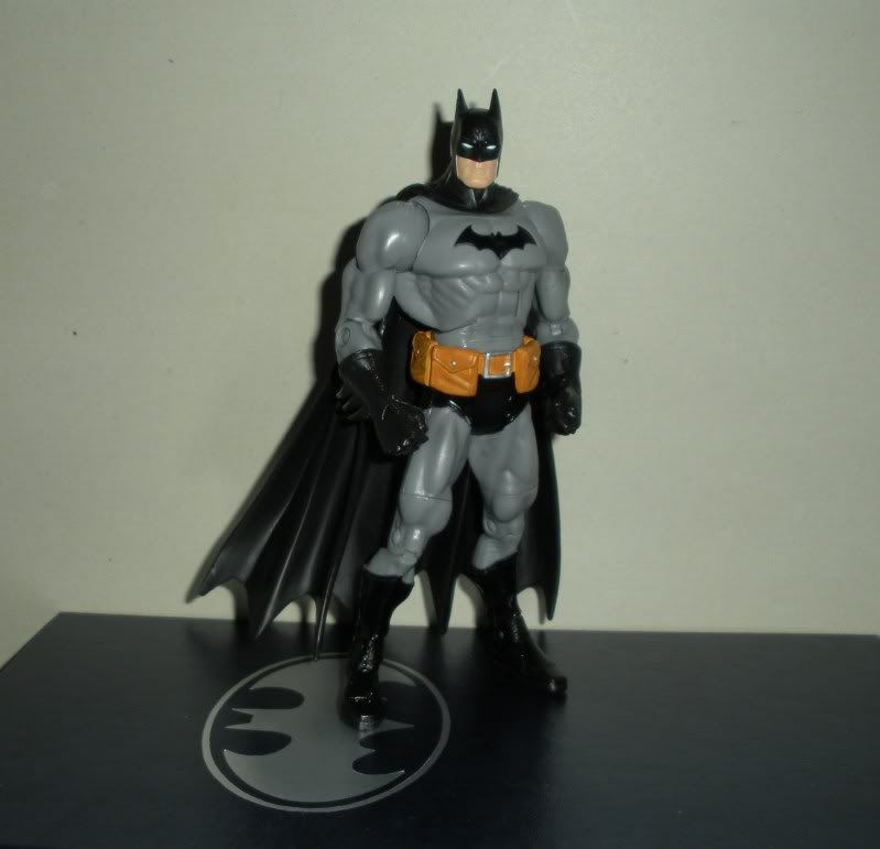
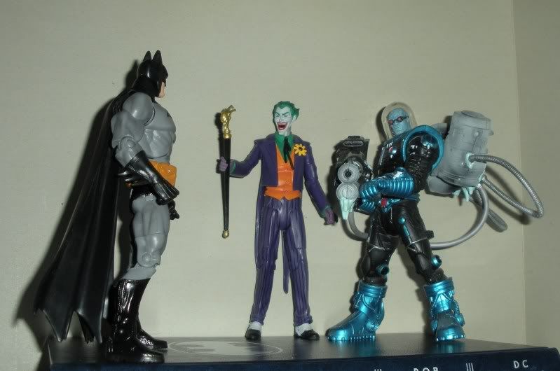
This brings us to Friday night. While in town, we stopped by Toys R Us for the first time in a couple of months. There I found the Batman Legacy line. There were some very cool figures, including a golden age-style Joker, a repaint of Mr. Freeze to match the colors the figure from the old Super Powers line sported, and a truly awesome Arkham City-themed two-pack. The one that came home with me was none of those, however. Front and center on the pegs was the long-awaited reissue of the black and gray DCSH Batman! He now had the head from the DCUC series 15 Batman, featuring a truly constipated grimace, but this was not a problem, as I have plenty of Batman figures at home to use for a head swap.

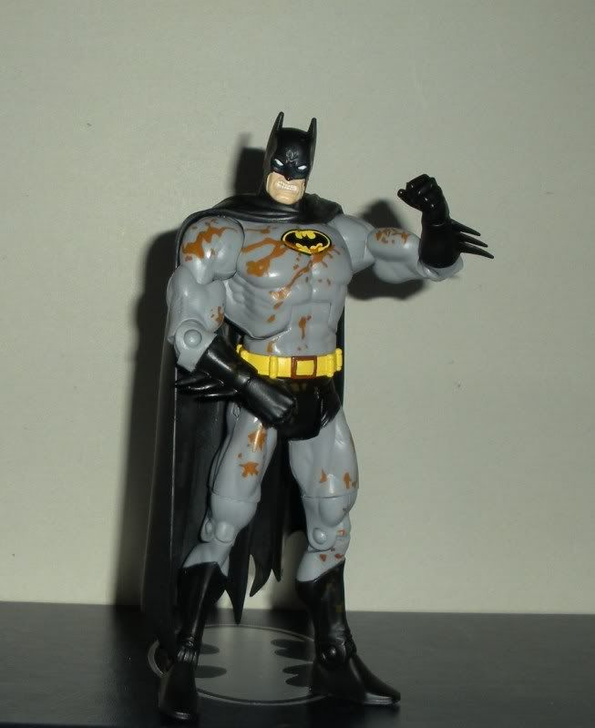
One head swap later, and I finally have my definitive Batman action figure! Behold his awesome definitive-ness!

As for the grimacing head, I put it on the figure for which I felt it was most appropriate...

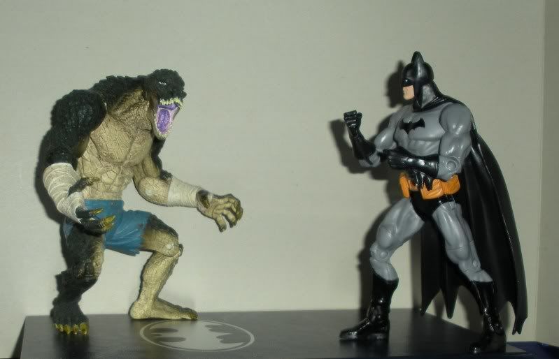
(It's not as bad as it looks, that's supposed to be mud. He came in a two-pack with Clayface.)  I leave you for today with a few more pics!