Tuesday, August 10, 2021

Rant Review: Masters of the Universe Origins Roboto figure


The MOTU line made a habit of creating characters who were good/evil counterparts, and Roboto fits into that category pretty well. With his moving jaw and trio of interchangeable weapons that plug into his arm, I pegged him as Trap Jaw's nemesis right away, and it's always surprised me that most don't seem to see him in that light. Whoever you match him up against, Roboto is among the most visually interesting characters in the MOTU mythos, and often pops up on "top ten" lists. He was never my favorite, but his bright colors, cool clear torso, moving gears, and swappable weapons made him a constant presence in my play scenarios. He also has the distinction of having one of the very best redesigns in the 2002 iteration of MOTU. Is this newest incarnation of the classic character in the same class as what's come before? Read on...

It's clear that much of this wave's budget went toward tooling for Roboto, as he features all-new parts from the waist up. The arms have some very nice detailing, and would serve well as the arms for an Origins-style New Adventures Skeletor, if Mattel were so inclined. (Let's hope so! I'd love some NA space mutants in this line!) The head has a slightly different shape from the vintage toy, most noticeably with the jaw piece. This isn't a bad thing, as it's still clearly Roboto, and it looks quite sharp. The torso has fewer gears than the vintage toy, and while that has been the subject of much complaint, I can't say it hurts the figure's appearance at all. The legs, inherited from Trap Jaw and Man-E-Faces, have the same stubbiness that bugged me with those figures. They were smaller for a reason in the vintage line, but now the design team is simply recreating a shortcoming of the '80s toys for no good reason, and it's annoying. These legs also have the issue of being slightly turned inward, and with no thigh cut, there's no way to fix this. It's not a huge problem, and it seems that most people don't even notice it, but once you do, it's impossible to not see it. 

Roboto has the sparse paint apps that are typical of this line, but what's here is applied very neatly by the standards of a mass-produced toyline. The red-on-blue combination can sometimes be problematic, but the red on the left arm is applied thickly enough that the bold blue doesn't show through. The silver on the thighs is also very neat, and the underlying red does not bleed through. Roboto has swivel & hinge shoulders, elbows, left wrist, hips, knees, and ankles. a hinged jaw, and swivels at the calves, waist, right wrist, and neck. The action feature necessitates the removal of the ball-jointed head that is present on most other figures in the line.

What's that? An action feature on a basic Origins figure? That's right! Just like the vintage figure, as you turn Roboto's waist, the gears inside his torso turn, and his jaw opens and closes. It's a neat feature that's fun to mess with, but whether or not it is worth compromising a key point of articulation is something that will vary from person to person. Roboto includes his standard trio of weapons that plug into his arm. The gun, claw, and laser axe are all molded in a bright silver, and swap out with no trouble. Unfortunately, the pegs are significantly shorter than those on Trap Jaw's attachments. You can share their attachments, but the fit isn't perfect, as seen below. The wave three minicomic is also included. 

As a fixture in most iterations of MOTU, Roboto was always going to be a much-desired figure, so it's nice that Mattel did a good job with him. I'd like to see them correct the issues with these legs, but I really don't see that happening, sadly. This is Mattel we're talking about, after all. It also would have been nice to have the normal range of motion in the head, but I get why this was compromised. Neither of those issues are major ones, and they don't hold Roboto back much. This is a well-made figure, and regardless of how important the character is to you, he's a standout figure in the Origins line. With all his parts, and even an honest-to-god action feature, he's almost a deluxe figure masquerading as part of the basic line. With some of these figures coming in mighty light in terms of accessories, you could do a lot worse than prioritizing grabbing a Roboto for your collection over some of his fellow figures. That's it for today, but pop back over in three days for more! Until then, stay safe out there, and happy hunting! 

Monday, August 9, 2021

Rant Reads: The 007 Re-Read Project


As longtime Rant readers remember, this blog began as a classic horror blog. It quickly expanded to encompass pretty much anything that interested me, and has been taken over by toy reviews in the past few years. While there's nothing at all wrong with that, I've been wanting to expand the range of content again recently. As part of that, the 007 Re-Read Project was born.

I've been a Bond fan for decades. My fascination with the character and his world extends nearly as far back as my love for MOTU, dinosaurs, and Batman. Roger Moore is the first Bond I remember seeing; I have hazy memories of watching The Spy Who Loved Me when I was very small. I would come across the movies on TV every so often, and would usually drop whatever else I was doing so I could watch. While I enjoyed the goofy excess of the Moore Bonds, Sean Connery was darkly charismatic in a way unlike anyone else I had ever seen, almost like a charming villain who was on the side of the "good guys." He quickly became my Bond of choice. I remember seeing trailers for License to Kill when I was 10, and I badly wanted to see it. Trips to the theater were rare, however, so I didn't get to see it until I got a VHS copy of it a couple of years later. (And it didn't disappoint! Contrary to the dismissive views of it you'll find scattered across the internet, I think it's one of the best in the series. It also ranks with Dr. No and From Russia with Love as the movies that are closest to the Fleming novels.)

I was vaguely aware that there were James Bond novels, but I don't remember ever seeing any of them in stores. During the six year gap of the early '90s, which saw no Bond movies, and very little media featuring the character at all, Bond kind of faded into the background for me. I would still watch the occasional movie on TV, but that was pretty much it. Then, 1995 rolled around. A new Bond was on the way! Goldeneye was the first Bond movie I got to see in the theater, and it reignited my love of the franchise. I was talking about it with a friend at school some time later, and suddenly remembered that there were all these books I'd never read. I mentioned this to my friend, and he revealed that he had actually read some of them, and proceeded to rave about how awesome they were! I resolved then and there to track some of them down.


This was easier said than done in the US in the '90s. The original 007 novels by Ian Fleming were inexplicably out of print, so one was limited to any remaining stock that might be lingering at local bookstores, along with whatever they could find at the library. I managed to find a paperback copy of a single book at the local Books-a-Million. Thus, my first Bond novel was The Man with the Golden Gun. Definitely not the best choice, as this is generally considered some of Fleming's weakest work, but it was good enough to make me want more. A trip to a the local library turned up another half dozen or so novels, and I resumed my reading with the novel version of my favorite movie: Goldfinger. I was hooked.

Over the next couple of years, I tracked down all 14 of Ian Fleming's Bond books, even accruing a couple of first editions along the way. Thanks to a gift from a friend, I discovered that there were an additional fourteen novels and two movie novelizations penned by John Gardner, who picked up 007's adventures beginning in 1981. (The gift was a hardcover copy of Seafire, which he had come across while perusing the BAM sale tables. As much as I had dug through those myself, I have no idea how I missed seeing it!) I hunted all of these down in short order, though his novelization of the film License to Kill took a bit of doing. 

A year or so later, I had started working at BAM, and had a customer ask me if we had any copies of Zero Minus Ten by Raymond Benson in stock. I checked to make sure that we carried it-- BAM had no inventory system, you could only check the microfiche to make sure that we carried a title before going to look for it on the shelf, a system that was woefully outdated even in the late '90s-- and took him to the fiction section to show him where it was. Removing it from the shelf, I saw that it was a James Bond novel! (I'm still shocked that the publisher's promotion of the books was so poor that even someone like me, who made it a point to buy and read these novels, and even worked in a bookstore, had no idea that it even existed prior to this!) Handing the customer a copy, I grabbed the other one for myself. I quickly devoured it, and while it wasn't on par with the best of Fleming, I enjoyed it quite a bit. A quick search of the author's name on the BAM computer revealed that Benson's second Bond novel had recently been released in hardcover, so I ordered a copy, and the collection continued to expand.

In the midst of this, while in a used book store in town, I came across a paperback Bond novel I had never heard of before. It had nice pulpy painted art on a white background, with the title Colonel Sun emblazoned across the cover in large block letters. Written by Kingsley Amis under the pen name Robert Markham, it was a curiosity to me. It had been published only a couple of years after Fleming's final Bond book, yet the lists of books I'd hunted down had not mentioned it. As I commence re-reading the Bond continuation novels, we'll begin with it. Be here next Monday! 

Friday, August 6, 2021

Rant Review: Masters of the Universe Origins Clamp Champ figure


One of the best aspects of Mattel's MOTU Origins line, in my mind, anyway, is how they're mixing up the release order of the figures. This has drawn a good bit of ire from some collectors-- How the hell can we get Ninjor before we have Moss Man, for instance-- but, as I've said before, this is a good thing because it allows for some excitement about what may be in future waves. If Mattel were just lazily following the vintage rollout, we'd know exactly what was coming, and when. That's just no fun. It also allows those of us who count some of the later figures among our favorites to get the Origins incarnations of them much sooner than we otherwise would! All that is a rather long-winded way of saying that we've already gotten the mighty Clamp Champ less than a year into the life of the Origins line! 


I went on at length about this in my review of the MOTU Classics iteration of the character, but Clamp Champ was an instant favorite of mine back when I was a kid. As many have pointed out, he seems like a throwback to the early days of the MOTU line, with his reuse of basic parts with only a new head. The later years of the line were dominated by increasingly bizarre and gimmick-dependent figures, while the Champ seemed almost like an early figure that had been held in reserve for later. Rather than being designed to accommodate a play gimmick, he was a solid "meat and potatoes" figure whose action feature was supplied by his weapon. And what a weapon it was! The massive clamp was easily one of the most intimidating weapons in the vintage line, and its function was great fun to use. My vintage clamp still works, and I found myself unable to resist clicking the button down repeatedly when I got it out for the photo comparison. How does this new incarnation of the figure and his weapon measure up? Read on...


The sculpt is identical to He-Man from the neck down, and as a deluxe figure, the Champ gets a pair of new heads. One has a stern expression similar to that of the vintage figure, though his mouth is slightly open in a He-Man style grimace. It's a good sculpt that communicates the character's determination, and definitely gives off the vibe that this is not a person to be messed with. The alternate head has a big grin, and works equally well as the Champ enjoying a good joke, or exulting in his prowess in the heat of battle. The paint apps are typically sparse for this line, though what's here is applied neatly, for the most part. There's a bit of overspray on the belt, and the eyebrows on the grinning head are misaligned with the sculpt. It's rather tough to notice unless you look very closely, and thankfully, it doesn't make the head look silly or odd like the misaligned paint apps on many of the yelling heads that were included with Battle Armor He-Man. Still, it does change the overall appearance from what the sculpt intended, and it's a shame this happened. Every one of these heads I've seen has this issue, so it appears to affect a much larger portion of the run. There is also a variant of Clamp Champ that has much lighter skin, which seems to have been mostly found in Canada when the figure was first popping up. 


The Champ has the line's standard articulation, with swivel & hinge shoulders, elbows, wrists, hips, knees, and ankles, swivels at the boot tops and waist, and a ball-jointed head. Every point of articulation moves and holds poses well, and they pop apart in the usual spots for easy part swapping. As always, I recommend heating the elbows, hips, knees, and ankles before popping them off. As ever, this is a very good articulation model, and I enjoy posing these figures quite a bit. 


As a deluxe figure, the Champ has a nice suite of accessories. Aside from the aforementioned extra head, there's the armor, a swappable grasping left hand, the famous clamp, and a set of pincers. The deluxe wave one minicomic is also included, and is the same one we got with the Battle Armor figures. The armor is a repaint of Fisto's-- though, as this figure was released first, I reckon that makes it a "pre-use"-- and the pincer is based on a weapon that was intended for the Champ's 2002 iteration, if that line had survived long enough for him to be released. A version of it was previously seen in the Classics line. 


The clamp itself is closely modeled on the vintage version, though the sculpting is noticeably softer in a couple of areas. The indentation for the thumb on the underside, present on the vintage clamp, is missing here, which makes it a bit more difficult for the figure to hold. It also functions slightly differently; whereas a press of the button on the vintage clamp released the pincers, and they sprang back into the clamp when the button was released, the pincers on the Origins version are released at the press of the (now silver) button, and they remain deployed until manually retracted. Which method is best is really down to personal preference, but personally, I prefer the way the Origins clamp functions, as it makes it easy to pose the Champ with another figure trapped within the pincers. With the vintage clamp, you'd have to come up with a way to block the pincers from retracting. 


While many collectors won't consider Clamp Champ an essential character for their collections, he is essential to mine, and I'm damn happy to have him included in the Origins line at such an early stage. Whatever your personal feelings about the late-wave stragglers of the vintage MOTU line, this is a figure that includes a robust assortment of accessories, and a pair of head sculpts that rank among the line's best. The Champ is a worthy addition to any Origins collection, and with his profile hopefully being raised by his inclusion in the MOTU Revelation animated series(I wrote this review before it premiered, not knowing that, sadly, he'd only appear in the show for a few seconds), this figure is likely to become more and more desirable. If you're on the fence about this one for some reason, I recommend grabbing one while you can. That's it for today, but head back over in four days for more! Until then, stay safe out there, and happy hunting! 


Tuesday, August 3, 2021

Rant Review: Masters of the Universe Origins Evil-Lyn figure (version 2)


Mold reuse is one of the most efficient ways to keep costs down in a toyline, and Mattel has gotten more mileage out of that practice than many of their competitors over the years. The original MOTU line was created with mold reuse in mind, even molds from other toylines. This design philosophy enabled the MOTU Classics line to prosper for over a decade, and it's been apparent in the Origins line from the beginning. (Its first release was a two-pack of figures using the exact same parts, with only a few accessories to mix things up, for Grodd's sake!) When Mattel has an opportunity to release a figure that is 100% mold reuse while also giving us a fan-demanded variant, it's a win/win situation! Is that enough to make this 2002-inspired Evil-Lyn an essential purchase for the discerning Origins collector? Read on...


This figure's sculpt is exactly the same as the original release from last year, for better and for worse. It's a straight update of the vintage figure with slightly sharper detailing in most areas, apart from the head. The facial expression is different, and it looks more like the vintage Evil-Lyn's sister than the vintage Lyn herself. Again, this slightly different look isn't really a bad thing, but it is worth noting. (Also be aware that there is a running change with this figure that features improved knees. They're far less ugly than the original design. Mine, sadly, has the old ones.) Unfortunately, the 2002 incarnation of the character had a unique outfit, rather than getting her outfit at the same store Teela shops at, so a simple repaint of the same mold is not enough. This figure needed a few newly tooled parts, but Mattel took the cheap route and settled for a repaint. It sucked when they did it in the MOTU Classics line, and it sucks now. I also had the same quality control issue my first Origins Lyn had, as the damn helmet is crooked! Check out the photo below. 


Evil-Lyn has a slightly more complex paint job than many of the figures in this line, and it's applied neatly. Lines are crisp and clean, with minimal overspray. The lighter lavender apps over the darker purple and black areas are particularly well done, are thick enough that the darker color does not show through. The articulation is standard for the line. Evil-Lyn has swivel & hinge shoulders, elbows, wrists, hips, knees, and ankles, swivels at the waist and boot tops, and a ball-jointed head. All of the joints move and hold poses well, and pop apart in the usual spots for easy swapping. 


As with this figure's first release, Evil-Lyn comes up short on the accessory front. She has her magic staff and the wave five minicomic, and that's it. As a release that is 100% reuse, Mattel really should have given us something more here. An alternate head, a cape, the dagger that came with the 2002 figure upon which this color scheme is based, a staff that looks more like the 2002 version, a swappable hand or two, magic blast effects, even a couple of paint apps on the staff to make it look less bland... the possibilities are endless, yet Mattel took the cheap way out once again. That seems to be the biggest ongoing theme with this line, and it's a damn shame. 


Like I said, we're well used to repaints in MOTU lines. With this figure's resemblance to such a popular version of a very popular character, Mattel had a chance to do something special here, but they played it safe and pinched their pennies even more than usual, and the figure really suffers as a result. Despite my love for the 2002 iteration of MOTU, I really can't recommend this figure unless you don't yet have an Evil-Lyn at all. This one will fill that role perfectly well if it's to be the one and only in your Origins collection. If you already have the previous release, which felt too light on accessories itself, there's really no need to part with your cash for this one unless you absolutely must have every release. Mattel let us down here, and with so many more cheap repaints on the way, let's hope that this won't be their standard practice going forward. Many of us are ready to stick with this line for the long haul and do our best to ensure it enjoys a long life, but Mattel needs to hold up their end by delivering product that is worth our investment in time and money. That's it for today, but cast a spell to remind yourself to swing back by in three days for more! Until then, stay safe out there, and happy hunting!


Friday, July 30, 2021

Rant Review: Masters of the Universe Origins Mer-Man figure (Lords of Power)


 As many figures as Mer-Man has been given, many of us have never gotten the exact early minicomic version we wanted. As seen in the first three Alfredo Alcala-illustrated minicomics, this design was based on the character's B-sheet design and prototype figure. The 2002 version was a step in the right direction, giving us a head sculpt that was directly based on the cross sell art for the first time. The Classics figure got us much closer, looking as if he had stepped right off one of the vintage cardbacks. Still, as it drew directly from the cross sell art, it had some key differences from the Alcala version that so many of us had wanted for decades. Now, at last, Mattel has finally give us this figure. (Well, sort of.) There was a bit of a stink when it became clear that at least two of the figures from last year's horrifically expensive Lords of Power convention exclusive set would be reissued in the retail line, but the general reaction has been surprisingly positive. It seems that the color differences, as well as the lack of the exclusive version's amazing packaging, is enough to satisfy most. 


The sculpt utilizes many parts we've already seen many times over, with a few key newly-tooled pieces. The head sculpt is fantastic, capturing the design's distinctive look. The goofy expression is just perfect. There are also new forearms and calves, and smooth MOTU WWE trunks are used in place of the traditional furry loincloth. This should have a scaly pattern, but Mattel went the cheap route here. It's unfortunate, but an easily overlooked detail. The hands are a bigger issue. Instead of tooling new webbed four-fingered hands, the standard He-Man hands were reused. They also neglected to include a new "gills" piece, as the Classics figure had. Looking at the art and prototype, it's something that was clearly needed for total accuracy. This is a great-looking figure, but it's frustrating to have it fall just short of perfection thanks to cost cutting.


Most of the figure's paint apps are on its head, and they're very neat and clean. Mer-Man has the line's standard articulation, with swivel & hinge shoulders, elbows, wrists, hips, knees, and ankles, swivels at the calves and waist, and a ball-jointed head. All joints move easily and hold poses well, and pop apart easily at the shoulders, wrists, waist, calves, and neck for easy part swapping. With a bit of applied heat, you can separate the other parts, too. Mer-Man has the same sword as the previous figure, and two new pieces of armor to replicate the prototype's appearance. The sword isn't totally accurate, but it's close enough, honestly. These new armor pieces are great, though the little shoulder flaps recall the vintage toy more than the prototype, to my eyes. Given Mattel's reluctance to invest in new tooling any more than absolutely necessary, it wouldn't have shocked me if they'd simply re-used the existing Mer-Man armor, so it's very nice to see that they went the extra mile here. It helps make up for the cost-cutting in other, less vital areas. The wave five minicomic is also included, but poor Mer-Man is relegated to simply standing around in a couple of panels. 


Any figure with so much anticipation is bound to disappoint some, but even with a few imperfections, I'm damn happy to finally have it. It's not 100% accurate, but it's the closest we've ever gotten, by far. The imperfections are small enough that I can overlook them. It's unfortunate that costs were cut at all, but since they were, at least the design team chose the right pieces to focus on. I won't be ditching the wave three version, but this will be the standard Mer-Man in my Origins collection going forward. It's very cool that the Origins line has a Mer-Man for you, whatever your preference! That's all for today, but head back this way in four days for more! Until then, stay safe out there, and happy hunting!

Tuesday, July 27, 2021

Rant Review: Masters of the Universe Stratos figure


Another of the original eight figures from the vintage MOTU line has made his Origins debut! Stratos, everyone's favorite winged jetpack-wearing ape man, was something of an anomaly in the MOTU line, as he included no weapons. Sure, he had his armor and wings, but all of the other figures had some sort of armor, plus weapons, to boot! This made him rather unpopular among my peers back in the day, as we would tend to choose a figure with more gear whenever we were able to pick out a toy. This relegated Stratos to the status of a "gift figure." I don't know how widespread this was, but practically everyone I knew who had Stratos had gotten him as a gift because he was never one they picked out themselves. Unlike most of my MOTU toys, I have no memory of when I got my Stratos. It was very early on, though, and I had the more prevalent red wing/blue armor version. I always liked him, though he wasn't a favorite. Still, as one of the original eight, he's practically guaranteed a place in every incarnation of MOTU toylines. How does this newest version fare? Read on...


The sculpt is no surprise, as he remains Beast Man from the neck down. The same fur detail is present, and it remains a good sculpt. The smooth "baby booties" he has for feet still bother me, though. Obviously, this line is heavily based on the vintage toys, but improving on aspects of the design such as this falls well within its purview. Stubbornly sticking with these smooth, bland feet just feels lazy. The spiked weapon on the back of the right hand is also present. (As some lines have dispensed with this for Stratos, it's worth pointing out.) The wings have some nice detailing, with some nice fine texture work on the feathers. The head is a bit of a departure from the vintage figure. It has a slightly different expression, and is wider, particularly at the base. I imagine the wider base is to allow for a good range of motion, but it changes the look noticeably. It's not a bad thing, just worth noting. 


As usual, there aren't many paint apps, but what's there is applied very neatly for a mass-market retail toy. The light blue used on the goggles pops nicely, though it's worth pointing out that the eyelids are not painted gray, as was the case with many runs of the vintage figure. Mattel opted for the blue wing/red armor color scheme for Stratos's debut in the line, and the parts are molded in the appropriate colors. This isn't my preferred color scheme, but I don't dislike it. If you have a MOTU WWE Rey Mysterio handy, you can do a quick and easy swap to get the red winged version, if you like. 


Speaking of those wings and the armor, well, that's all Stratos comes with. The armor fastens at the front, and the wings clip onto the wrists. This is a simpler method than the vintage figure used, and sidesteps some of the problems the original figure had. This wave's minicomic is also included. This is another figure that feels mighty light, and he really could have used an energy blast, a Grayskull mace, or, y'know, the Staff of Avion. The staff is even featured in the included comic! Would it have killed them to include it? It just feels a little chintzy. The standard articulation is present, with swivel & hinge shoulders, elbows, wrists, hips, knees, and ankles, swivels at the waist and calves, and a ball-jointed head. 


Despite not being the most exciting figure, Stratos has become a fan favorite over the decades, and I'm glad to see him pop up in the line early on. Given the possibilities for color variants and army building, we'll surely be seeing him again. When that happens, hopefully the design team will improve on some of the figure's shortcomings. I'm pretty sanguine about this figure's lack of any weapons, but I won't be so forgiving if it happens a second time. That said, these figures retail for $15, so you're still getting a decent value, and adding a core character to the collection. Stratos has only gotten cooler over the years, so I definitely don't regret adding this fella to my Origins collection. That's it for today, but fly back over for more in three days! Until then, stay safe out there, and happy hunting! 

Friday, July 23, 2021

Rant Review: Masterverse Skelegod figure (MOTU Revelation series)


Unlike many other '80s properties that have maintained a steady presence on retail store shelves, it's been either feast or famine for MOTU collectors over the years, and we've endured many long dry spells with little to no product. We've bellied up to the table and strapped on our extra large bibs lately, however, with the Origins line rolling mercilessly along, and a brand new line hitting stores right now! (And yet another one on the way!) The Masterverse line presents us with figures in the style of the new high-profile Netflix series, and in honor of its debut today, we're taking a look at my inaugural figure in the line, the deluxe Skelegod! Will he convert you into a devoted follower, or make you wish you were agnostic of this line? Read on...

The figure appears to have a 100% unique sculpt. There are a few parts that may be shared with some of the standard Masterverse figures, but as I don't have any of those yet, I can't verify that. In any case, the sculpting is very well done, capturing the animated style very well, while adding some additional detail in a few areas. The horns, in particular, have some nice texture work, though the level of detail almost makes them look as if they belong to another figure. The segmented armor and large pauldrons help make this tall figure appear even larger, giving him an imposing appearance on the shelf. It's not always apparent in photos, but the stylized "H" on the figure's chest is actually sculpted as well, not just painted on. The green flames surrounding the figure's neck are molded in a nice translucent plastic, which adds to the cool factor. The neon green neck sticking out of this piece is nested within the flames enough that it doesn't look too odd. The "face" is, well, Skeletor, in keeping with the skull design we've seen in the trailers for the show. This line's figures have been criticized for having pinheads, but the large horns help make this figure's head appear more proportional. There's a fairly large three layered cape, in two shades of purple, and a pair of plastic diamonds on the ends of the second layer. The overall design of the cape is very cool, but it's made of fabric that looks and feels as cheap as it undoubtedly is. 

The paint apps are more complex than what we get on the Origins figures, yet remain very neat. Lines are sharp and clean across the board, even in areas with tricky color combinations such as the purple and neon green on the chest. The one bit of slop is with the neon green paint in the nostril section of the right leg, and it's so tiny that I only noticed it because I was really looking for it. There's also a nice paint wash on the figure's "skin," lending it a nice battle-worn look. The only issue with it is that the wash was apparently applied after the figure was assembled, so when you bend the elbows or knees, interior areas lacking the wash are exposed, which is a little jarring. This can be easily fixed, of course, but it shouldn't have to be. 

Skelegod has a nice quartet of accessories: A pair of swappable hands, a cool energy effect, and the Sword of Power. The hands swap out easily, and fit into place snugly without a tendency to fall off. The energy effect can fit over any of the hands, and looks like Skelegod is about to launch one nasty hadouken. I'm not crazy about the sword's design, but it matches its onscreen counterpart very well. The plastic use isn't overly rubbery either, so there shouldn't be any issues with it drooping over time. It fits well into the grasping hands, and thankfully, it stays in place far better than its counterparts in the Origins line. 

Mattel has been touting a higher level of articulation for the Masterverse line, and this figure delivers with swivel & hinge shoulders, wrists, hips, and ankles, swivels at the biceps, thighs, calves, and waist, what appears to be a ball-jointed torso with a limited range of motion, a ball-jointed head, and, thank Grodd, double knees and elbows! Those have been standard points of articulation for well over decade now across many lines, yet Mattel has dragged their feet about implementing them in most of their collector lines. I've seen a few collectors complaining about it, but aesthetically, they don't look any worse than single joints, and they work far better. This is a win as far as I'm concerned, and it's been a long time coming! 

The Masterverse line has proven divisive among MOTU collectors, and only time will tell what kind of legs it has. For me, the jury is still out on the basic Masterverse figures, as I haven't yet found any of them, but this one has me hopeful. Skelegod is very cool indeed! That's all for today, but swing back by in four days for more. Until then, stay safe out there, and happy hunting! 

Tuesday, July 20, 2021

Rant Review: Masters of the Universe Origins Mer-Man figure


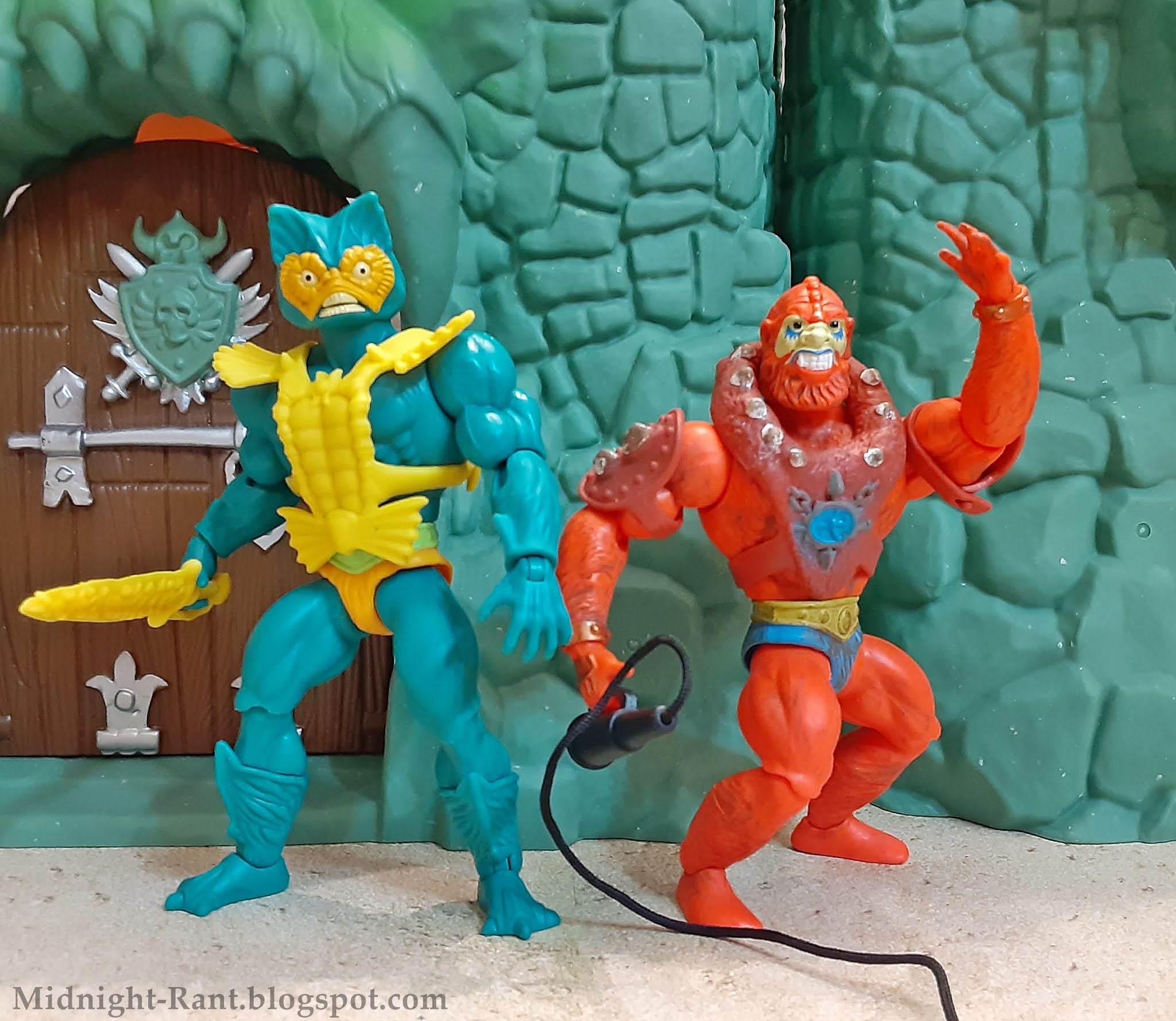
Today, in a special bonus review, we're looking at one of the earliest and most beloved MOTU villains, that scaly scalawag himself, Mer-Man! Originally called Sea Man (wonder why that name didn't stick?) during development, Mer-Man has been present since the earliest MOTU media, though his appearance was slightly different in the first minicomics. He has been an ever-present figure since, and is practically guaranteed to make an appearance whenever MOTU characters pop up in any sort of licensed product. There's quite a lot of debate over which incarnation is superior, but Mattel have stuck to the vintage toy's design in his Origins debut. How does it match up against earlier iterations? Read on...


As expected, the figure's sculpt is Skeletor from the neck down. It replicates the vintage figure with a bit more detail, with the calves, in particular, displaying some nice texture work. The head retains the "cat head" design of the vintage figure, though his expression has been altered. Mer-Man's face now looks more aggressive, rather than the "surprise prostate exam" look of the vintage toy. There are numerous details that could have been integrated from other Mer-Man designs that we've seen over the decades, but the design team set out to slightly update the vintage toy with this figure, and it certainly succeeds in that.


Mer-Man's paint apps are limited, but very neat. The belt is painted in light green, as with the early runs of the vintage figure. The work on the head is particularly good, with sharp, clean lines and almost no slop or overspray, even on the tiny sharp teeth. However, it's worth mentioning that the extra figure I bought for my little niece to play with has some glop around the eyes, so it's always advisable to take a moment to choose the figure with the best paint apps if you're able to do so. 


Mer-Man has his standard accessories in his sword and armor. The sculpting has some nice detail, and the little points on the top of the armor are surprisingly sharp. The little "bow" over the figure's belt is actually a part of the armor now, rather than a separate piece, which solves the issue many vintage Mer-Man figures have with that piece falling off over time. The sword fits easily in the figure's hand, and unlike some of this line's accessories, is not prone to falling out. The wave three minicomic is also included. As always, despite the limitations imposed by the miniscule page count, it's awesome that we're actually getting minicomics with these figures! Mer-Man has the line's standard articulation, with swivel & hinge shoulders, elbows, wrists, hips, knees, and ankles, swivels at the waist and calves, and a ball-jointed head. All points of articulation work very well, and the head in particular has an excellent range of motion. The pieces pop apart in the usual spots, though I do recommend heating the elbows, hips, knees, and ankles before trying to pop them apart. 


This figure doesn't innovate or do anything other than the expected, but what the team did with this figure, they did very well. I still feel that figures with only one accessory should include little bonuses like energy, or in this case, water blast effects, or a swappable hand or two. Despite the very reasonable $15 price point, some of these figures feel mighty light. Still, it's a very well-executed update of the vintage toy, and in the end, that's enough to make him a desirable addition to any given Origins collector's collection. It's also nice to see Beast Man joined by the other original henchman! As the cast of characters continues to fill out, it's nice to have the pair that started it all serving as the bedrock of Skeletor's team, as they were from the beginning. That's all for today, but swim back next week for more! Until then, stay safe out there, and happy hunting! 


Friday, July 16, 2021

Rant Review: Masters of the Universe Origins Tri-Klops figure

 Another core member of  Skeletor's  evil warriors has arrived! Released during the second year of the vintage line's run, Tri-Klops (along with Trap Jaw) was packaged with a cool glow-in-the-dark "warrior's ring," a presentation which gave the figure a "deluxe" feel in my mind. As most of Skeletor's group had monstrous or ghoulish appearances, his human look made him stand out among them. My immediate impressions of Tri-Klops were that he should probably be helping He-Man and his allies against Skeletor's legion of monsters, but that he must be especially bad since he was allied with the Lord of Destruction instead. The included minicomic presented a different scenario, portraying Tri-Klops as a mercenary hired by Skeletor to eliminate his hated foes. He was highly skilled and dangerous, and possessed a sense of honor. I found this intriguing, and it quickly became my preferred characterization for Tri-Klops. Subsequent portrayals have rarely embraced this interpretation, but it remains who the character is in my mind. The figure has been a favorite of mine since that day when I first saw him, so any new version has much to live up to. Does this newest version manage it? Read on...


The figure is the basic He-Man figure with a new head and armor, of course, which is no surprise. Those familiar parts are as well-sculpted as expected, and the newly tooled parts similarly hearken back to the vintage toy in most respects. The vintage figure famously had at least three distinct faces, and this one pretty much splits the difference between a couple of them. As with many of the core villains in this line, he has a more expressive face sculpt, a grimace that is well-suited for a mid-battle pose. The tiny teeth are distinctly sculpted. If you're expecting the cool little details the Four Horsemen hid underneath the visor on the MOTU Classics figure, however, you'll be disappointed; as with the vintage figure, his brow is devoid of detail. The visor itself is very faithful to its vintage counterpart, and rotates easily, though it's not so loose that it won't stay in position once you've fixed it where you want it. Each eye is traditionally supposed to represent a different vision-based ability-- x-ray vision, dista-vision, etc.-- but I, and I imagine many others, always used them to represent Trike's moods. Blue was when he was calm, red was for combat situations, and the fully red one only got broken out when he was seriously pissed off and ready to wreck someone! The tech-based details present on the 2002 and Classics figure are omitted in this vintage-based sculpt, so the eyes have the more organic appearance you'd expect from that approach.


The figure's paint apps, while few, are kinda all over the place in terms of quality. The teeth are perfect, and the eyes are very neat overall, but there's plenty of slop on the orange bits, and where the face transitions to the black headpiece. The armor also needed another coat of paint, as the green shows through the orange in several areas. There's a spot on the belt where the paint was apparently scraped off sometime before the figure arrived here. Things like this are pretty easy to fix, but then, they shouldn't have to be fixed. The stripes on the back of the armor are unpainted. It also would have been nice to have a slight gloss coat over the black area of his headgear to differentiate it from the black hair, but again, I get that they're not really doing things like that with this line. 


Unless you count his armor, Tri-Klops only has one accessory: his trademark sword. It improves on the vintage sword's sculpt by doing away with the holes that were molded into one side of the original one, and the plastic is stiff enough that it shouldn't wilt over time. It fits into a strap on the back of his armor, as expected. Alas, there is no warrior's ring. A doomseeker would have been an awesome inclusion. And yes, it's a 2002 element, but the line has included such things on occasion, so that sort of thing is clearly not off the table. Just one real accessory seems a little light for this line. The wave four minicomic is also included, and it's in line with what we've come to expect. There's just not much you can do when you have to feature so many characters in just a few pages. I still love that we're getting them, though! Tri-Klops has the standard articulation, with swivel & hinge shoulders, elbows, wrists, hips, knees, and ankles, swivels at the waist and boot tops, and a ball-jointed head. He also gets an extra point of articulation with his swiveling visor. All of these joints work well, and the parts pop apart easily at all the usual areas. As always, I recommend heating the elbows, knees, and hips beforehand if you want to pop those apart. 

This is a pretty simple figure overall, so it would have been tough for Mattel to screw it up. I still feel they're playing things a little too safe at times with this line-- not including appropriate accessories from the 2002 era, for instance-- but at the end of the day, this is mostly a vintage-based line, so I can't really fault them for sticking to that mission statement. Tri-Klops remains as cool as ever, even without any extra frills. I would have loved some of those extras mentioned above, but I love this character and the figure all the same. Anything extra, while nice, would just be window dressing. He's a core character, and I know I'm not the only one who likes to pair him with Trap Jaw as a team, so it's definitely nice to be able to complete that duo. That's it for this week, but use your dista-vision to find your way back here next week for more! Until then, stay safe out there, and happy hunting!