Tuesday, July 20, 2021

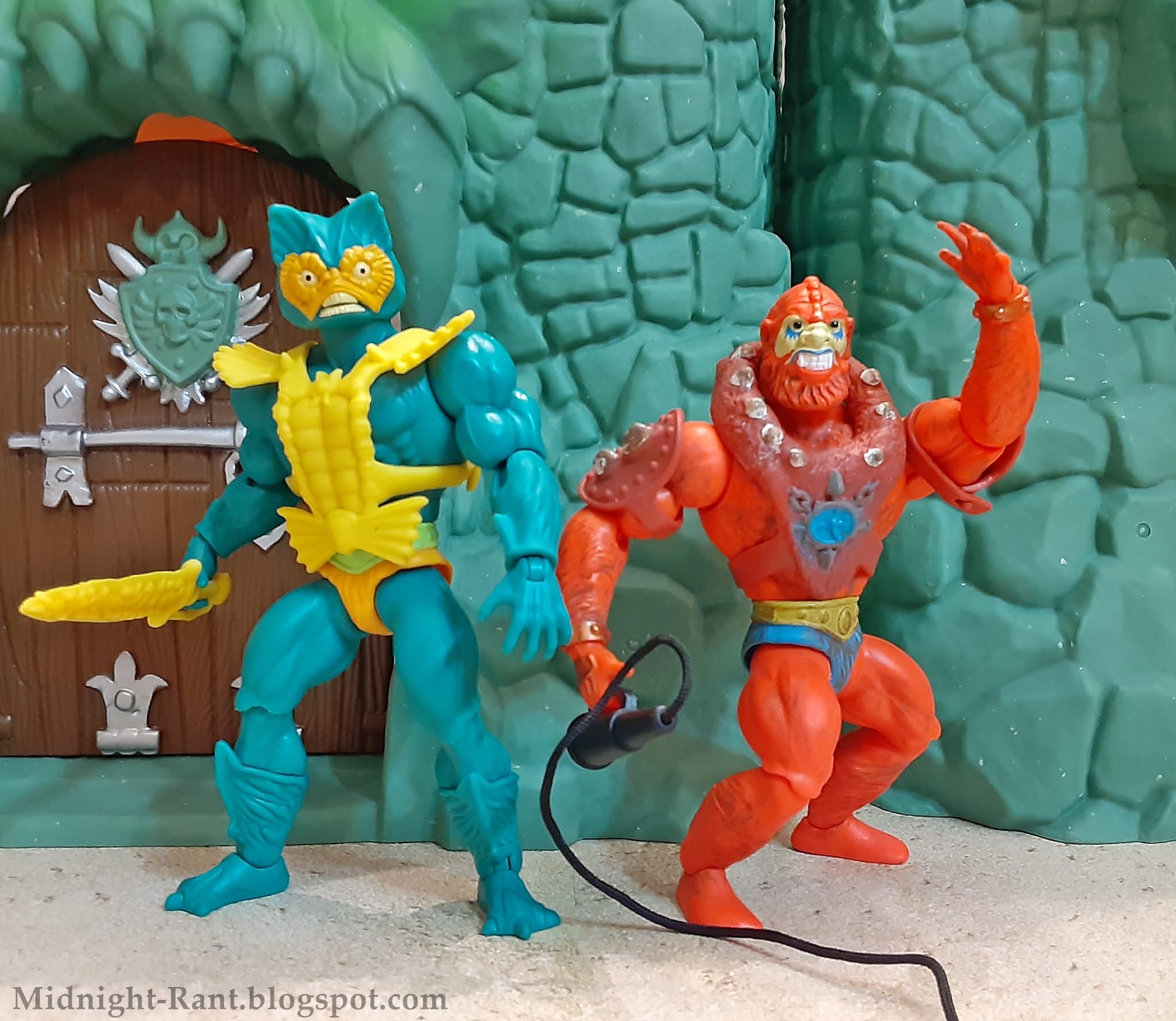
Rant Review: Masters of the Universe Origins Mer-Man figure


Today, in a special bonus review, we're looking at one of the earliest and most beloved MOTU villains, that scaly scalawag himself, Mer-Man! Originally called Sea Man (wonder why that name didn't stick?) during development, Mer-Man has been present since the earliest MOTU media, though his appearance was slightly different in the first minicomics. He has been an ever-present figure since, and is practically guaranteed to make an appearance whenever MOTU characters pop up in any sort of licensed product. There's quite a lot of debate over which incarnation is superior, but Mattel have stuck to the vintage toy's design in his Origins debut. How does it match up against earlier iterations? Read on...


As expected, the figure's sculpt is Skeletor from the neck down. It replicates the vintage figure with a bit more detail, with the calves, in particular, displaying some nice texture work. The head retains the "cat head" design of the vintage figure, though his expression has been altered. Mer-Man's face now looks more aggressive, rather than the "surprise prostate exam" look of the vintage toy. There are numerous details that could have been integrated from other Mer-Man designs that we've seen over the decades, but the design team set out to slightly update the vintage toy with this figure, and it certainly succeeds in that.


Mer-Man's paint apps are limited, but very neat. The belt is painted in light green, as with the early runs of the vintage figure. The work on the head is particularly good, with sharp, clean lines and almost no slop or overspray, even on the tiny sharp teeth. However, it's worth mentioning that the extra figure I bought for my little niece to play with has some glop around the eyes, so it's always advisable to take a moment to choose the figure with the best paint apps if you're able to do so. 


Mer-Man has his standard accessories in his sword and armor. The sculpting has some nice detail, and the little points on the top of the armor are surprisingly sharp. The little "bow" over the figure's belt is actually a part of the armor now, rather than a separate piece, which solves the issue many vintage Mer-Man figures have with that piece falling off over time. The sword fits easily in the figure's hand, and unlike some of this line's accessories, is not prone to falling out. The wave three minicomic is also included. As always, despite the limitations imposed by the miniscule page count, it's awesome that we're actually getting minicomics with these figures! Mer-Man has the line's standard articulation, with swivel & hinge shoulders, elbows, wrists, hips, knees, and ankles, swivels at the waist and calves, and a ball-jointed head. All points of articulation work very well, and the head in particular has an excellent range of motion. The pieces pop apart in the usual spots, though I do recommend heating the elbows, hips, knees, and ankles before trying to pop them apart. 


This figure doesn't innovate or do anything other than the expected, but what the team did with this figure, they did very well. I still feel that figures with only one accessory should include little bonuses like energy, or in this case, water blast effects, or a swappable hand or two. Despite the very reasonable $15 price point, some of these figures feel mighty light. Still, it's a very well-executed update of the vintage toy, and in the end, that's enough to make him a desirable addition to any given Origins collector's collection. It's also nice to see Beast Man joined by the other original henchman! As the cast of characters continues to fill out, it's nice to have the pair that started it all serving as the bedrock of Skeletor's team, as they were from the beginning. That's all for today, but swim back next week for more! Until then, stay safe out there, and happy hunting! 


Friday, July 16, 2021

Rant Review: Masters of the Universe Origins Tri-Klops figure

 Another core member of  Skeletor's  evil warriors has arrived! Released during the second year of the vintage line's run, Tri-Klops (along with Trap Jaw) was packaged with a cool glow-in-the-dark "warrior's ring," a presentation which gave the figure a "deluxe" feel in my mind. As most of Skeletor's group had monstrous or ghoulish appearances, his human look made him stand out among them. My immediate impressions of Tri-Klops were that he should probably be helping He-Man and his allies against Skeletor's legion of monsters, but that he must be especially bad since he was allied with the Lord of Destruction instead. The included minicomic presented a different scenario, portraying Tri-Klops as a mercenary hired by Skeletor to eliminate his hated foes. He was highly skilled and dangerous, and possessed a sense of honor. I found this intriguing, and it quickly became my preferred characterization for Tri-Klops. Subsequent portrayals have rarely embraced this interpretation, but it remains who the character is in my mind. The figure has been a favorite of mine since that day when I first saw him, so any new version has much to live up to. Does this newest version manage it? Read on...


The figure is the basic He-Man figure with a new head and armor, of course, which is no surprise. Those familiar parts are as well-sculpted as expected, and the newly tooled parts similarly hearken back to the vintage toy in most respects. The vintage figure famously had at least three distinct faces, and this one pretty much splits the difference between a couple of them. As with many of the core villains in this line, he has a more expressive face sculpt, a grimace that is well-suited for a mid-battle pose. The tiny teeth are distinctly sculpted. If you're expecting the cool little details the Four Horsemen hid underneath the visor on the MOTU Classics figure, however, you'll be disappointed; as with the vintage figure, his brow is devoid of detail. The visor itself is very faithful to its vintage counterpart, and rotates easily, though it's not so loose that it won't stay in position once you've fixed it where you want it. Each eye is traditionally supposed to represent a different vision-based ability-- x-ray vision, dista-vision, etc.-- but I, and I imagine many others, always used them to represent Trike's moods. Blue was when he was calm, red was for combat situations, and the fully red one only got broken out when he was seriously pissed off and ready to wreck someone! The tech-based details present on the 2002 and Classics figure are omitted in this vintage-based sculpt, so the eyes have the more organic appearance you'd expect from that approach.


The figure's paint apps, while few, are kinda all over the place in terms of quality. The teeth are perfect, and the eyes are very neat overall, but there's plenty of slop on the orange bits, and where the face transitions to the black headpiece. The armor also needed another coat of paint, as the green shows through the orange in several areas. There's a spot on the belt where the paint was apparently scraped off sometime before the figure arrived here. Things like this are pretty easy to fix, but then, they shouldn't have to be fixed. The stripes on the back of the armor are unpainted. It also would have been nice to have a slight gloss coat over the black area of his headgear to differentiate it from the black hair, but again, I get that they're not really doing things like that with this line. 


Unless you count his armor, Tri-Klops only has one accessory: his trademark sword. It improves on the vintage sword's sculpt by doing away with the holes that were molded into one side of the original one, and the plastic is stiff enough that it shouldn't wilt over time. It fits into a strap on the back of his armor, as expected. Alas, there is no warrior's ring. A doomseeker would have been an awesome inclusion. And yes, it's a 2002 element, but the line has included such things on occasion, so that sort of thing is clearly not off the table. Just one real accessory seems a little light for this line. The wave four minicomic is also included, and it's in line with what we've come to expect. There's just not much you can do when you have to feature so many characters in just a few pages. I still love that we're getting them, though! Tri-Klops has the standard articulation, with swivel & hinge shoulders, elbows, wrists, hips, knees, and ankles, swivels at the waist and boot tops, and a ball-jointed head. He also gets an extra point of articulation with his swiveling visor. All of these joints work well, and the parts pop apart easily at all the usual areas. As always, I recommend heating the elbows, knees, and hips beforehand if you want to pop those apart. 

This is a pretty simple figure overall, so it would have been tough for Mattel to screw it up. I still feel they're playing things a little too safe at times with this line-- not including appropriate accessories from the 2002 era, for instance-- but at the end of the day, this is mostly a vintage-based line, so I can't really fault them for sticking to that mission statement. Tri-Klops remains as cool as ever, even without any extra frills. I would have loved some of those extras mentioned above, but I love this character and the figure all the same. Anything extra, while nice, would just be window dressing. He's a core character, and I know I'm not the only one who likes to pair him with Trap Jaw as a team, so it's definitely nice to be able to complete that duo. That's it for this week, but use your dista-vision to find your way back here next week for more! Until then, stay safe out there, and happy hunting!


Tuesday, July 13, 2021

Rant review: Masters of the Universe Origins Land Shark

Today, in a special bonus review, we're taking a look at the Cadillac of MOTU vehicles: The Land Shark! Part of the 1984 lineup, the original Land Shark was an instant hit among my prepubescent peers. While I always felt like it should be Trap Jaw's ride, what with the chomping jaws and all, Skeletor claimed it for his own. In fact, between all its appearances in minicomics and package art, it really seemed to have supplanted Panthor as his main method of conveyance for a time.  I never got one as a child, but Origins has brought us a new iteration of the classic carnivore car! Can it possibly measure up to decades of anticipation? Read on...


Broken record time: The package this thing comes in is adorned with gorgeous art! If Mattel doesn't compile this stuff into an art book, or sell prints of it or something, they're really leaving a lot of money on the table. Anyway, once you tear your gaze away from that and open this sucker up, you can appreciate its size. While it's not as big as some of the absolutely massive vehicles we got in MOTU Classics, it's significantly larger than its vintage counterpart. While it's pretty close to being just a scaled-up version of the '80s version, there are some very fun added details. My favorite: The tips of the gun barrels are little shark heads! 


With its added size, pretty much any figure from the Origins line can fit into the driver's seat with no issues. (The usual exceptions for Ram Man and Orko may apply, though you can kinda get them in there.) It's tough to get the figures to actually hold the control levers unless you scoot them way forward, though, so it can be tough to get the driver in a pose that looks right. 


There are no paint apps, as everything is molded in the appropriate color. There is plenty of sculpted detail that can be painted if one so desires; Mattel just didn't choose to do so. There are some stickers to spice things up a bit, however. The largest are on the control panel and the vehicle's rear, and there are two small ones for the shark's eyes. These are all applied out of the box, thankfully, as I probably wouldn't have gotten them on so evenly. The eyes are already beginning to peel off of mine, though, which is a bad sign. This thing hasn't suffered any heavy play, or otherwise been manhandled. I'm not sure if it's due to the heavy humidity here or what, but I'm wondering if this is widespread. 

One of the most distinctive features of the vintage vehicle is intact: The chomping jaws! Roll the Land Shark backward or forward, and its jaws open and close, chewing up anything unfortunate enough to lie in its path. There's plenty of room to stick most of an Origins figure in there, or it can swallow some Imaginext figures whole. It's a fun feature, and the vehicle rolls freely with little force, so your little ones (if applicable) should be able to roll it across the kitchen floor with no difficulty. 


One of the benefits of having a MOTU line back at retail is the abundance of vehicles and steeds-- less than a year into the line's life, we've already gotten five!-- and the Land Shark is definitely one of the highlights so far. Whether Trap Jaw is its designated driver, or you decide to default to ol' Bonehead, or else you want Fisto to steal it for his own, it's loads of fun, and a worthy addition to your collection. As of this posting, Amazon has it for retail price, so snap one up now if you haven't already! That's it for today, but chomp your way back in three days for another review! Until then, stay safe out there, and happy hunting! 

Friday, July 9, 2021

Rant Review: Masters of the Universe Origins Castle Grayskull playset with Temple of Darkness Sorceress figure


Whenever MOTU is revived in toy form, there are a handful of questions you can count on hearing repeatedly. One of the foremost: Do you think we'll get a Grayskull? Whereas this seemed like a pipe dream in a line structured the way MOTU Classics was, we even managed it there. But with Mattel making a major push to return the brand to prominence by blitzing the retail aisles? It was a no-brainer! Still, with the chaos of the past year, the tedium of trying to order online via some of Mattel's retail partners, and, let's face it, Mattel's knack for generally finding a way to muck things up, finding this thing has been a good bit tougher for many people than it really should be. When you get down to it, many of us collectors already have a Grayskull or two in our collections that would work perfectly well with the Origins figures, so is this new version worth the trouble? Read on...

The fortress of mystery and power has an absolutely iconic facade, and each version has tried to capture its mystique in its own way. Many of us were hoping for a design that hearkened back to the Alcala art, and were promptly disappointed when the final design was revealed. I saw several describing it as having a Playskool quality, and honestly, I can see what they mean. This iteration of Grayskull has a more symmetrical, almost friendly look compared to the haunted, crumbling ruin of the vintage version. That said, it's not bad... it just takes some getting used to. The sculpt has some nice detailing that is right in line with the figures that are meant to inhabit the castle, and this even extends to the interior: The floors actually have sculpted floorboards and nails, with some nice wood grain detailing. The bottom floor has sculpted bricks, as well. No matter how much I love my vintage Grayskull, this is an objective improvement. Assembly is very easy, and you'll have the whole thing together within minutes. 


The paint apps are simple and sloppy. This isn't much of an issue when it comes to the nose and eye sockets, as the paint masking doesn't need to be precise; the paint apps on the vintage Grayskull facades were all over the place, so the bar is set pretty low on that score. The wooden roofs actually get some brown paint apps, but they don't cover the entire area. It looks worse than leaving them unpainted, frankly. There are also some odd light green highlights on the facade that don't seem to be there for any reason other than to look strange. These are easy issues to fix, thankfully. There are a few paint apps on the computer, which are much neater. That's right, the computer is an actual piece of plastic, rather than a piece of cardboard. The hanging banners are actual fabric, and the double-sided flag is a pair of stickers that are applied on either side of a plastic flag. This is much sturdier than just wrapping a sticker around a plastic rod, as with the vintage version. Other accessories include the throne, laser turret, combat trainer, ladder, and two weapons racks. There are pegs on some of the floor sections to attach the flag, turret, and trainer, and the throne snaps easily into place on the main floor. It's cool to have a pair of weapons racks, but unfortunately, Mattel didn't include enough weapons to fill even one of them. I suppose they want us to use some of the weapons we already have to fill them out. There are notches into which the ladder can fit, which makes for much sturdier play. There is also a sticker sheet, which features art that is clearly inspired by the vintage playset without copying it exactly. They're nice enough, but some of them lack the cool psychedelic quality of the vintage ones.


One "accessory" deserves its own paragraph. The Sorceress is included in her all-white incarnation as seen in the Temple of Darkness minicomic. I've seen a lot of grumbling about this, but as this is my preferred version of the Sorceress, I'm quite happy with her inclusion! Her sculpt is exactly what can reasonably be expected from a Sorceress figure in this line, adhering very closely to the vintage figure, with slightly sharper detail in a few spots. The falcon headpiece is the standout here, with some nice texture work on the feathers. Her wings, molded in translucent plastic, are separate pieces on hinges, independent of her arms. Considering the monstrosities we ended up with on the MOTU Classics Sorceress, it's nice to see this issue handled so well here. The paint apps are minimal, but neat. The face is pretty much perfect, though there is a tiny bit of slop around the edge of the headpiece. Still, this is well within the bounds of what I consider acceptable for a mass-produced retail toy. The line's standard articulation is present, with swivel & hinge shoulders, elbows, wrists, hips, knees, and ankles, swivels at the waist and boot tops, and a ball-jointed head. The head's range of motion is severely impaired by the falcon headdress, which is unfortunate, but not surprising. 


Unfortunately, I did run into a couple of significant quality control issues with the figure. First, when I removed the Sorceress from the packaging, she couldn't keep her legs together! Now calm down, this isn't a judgement on her character, but an issue with the figure's construction. I finagled the hips for a minute and managed to get them to click into a better position, but whenever I adjust her pose, they lock back into the splayed position. I'll have to heat & disassemble the hips to figure out what the problem is. The other QC issue will be tougher to fix. There's a little piece of excess plastic stuck to the front of the figure's abdomen. I've seen this sort of thing before; it likely happened when the pieces were removed from the mold at the factory. The sprue has a bit of melted plastic on the tip when it's removed from the mold along with the pieces, and sometimes some of this sticks to one of them. This one went unnoticed, and it's stuck quite firmly to the figure. It won't be easy to remove it without damaging the figure. This really shouldn't have made it past QC. 


The castle has a few cool action features. There is the trap door, of course, which has a much simpler mechanism than its vintage counterpart. It works well, and my little niece and I have had no issues with it functioning as it should. Unfortunately, this can not be said for the elevator. This damn thing works about as well as a submarine with a screen door. It constantly hitches when going up, and does it even worse when descending. All play involving the elevator stopped pretty early on, as my little niece got sick of struggling with it. I've checked to make sure it's assembled properly, and it is. It's just lousy. Thankfully, the jaw bridge works perfectly. Inserting the Sword of Power (or anything that fits into the slot, really) triggers a spring-loaded mechanism that unlocks the bridge, allowing entry into the castle. This is a fun feature that my niece loves playing with, and so far it has held up over dozens and dozens of uses without any issues. 


Putting aesthetics aside for the moment, there are quite a few little improvements over the vintage Grayskull. I've already mentioned the additional sculpted details on the interior, better versions of accessories that were formerly made of cardboard, and additional paint apps. There is also an additional bit of floor space, as the right hand turret actually has a back half now. This is a nice touch that improves the overall look and adds a bit more play, or display, space. The jaw bridge is molded in different colored plastic, so you don't have to repaint it or rationalize having a green wooden door. (Personally, I never had any problem believing that there were green trees somewhere on Eternia, but this has long been a sticking point for a lot of people.) Accessories such as the laser turret and combat trainer are better built, and feel much less flimsy than the vintage versions. The hinges and latches are also vastly better, and look to be far sturdier than the vintage designs. 

Conversely, there are still a few things the vintage castle has over the new kid. Most obviously, the plastic quality of the new castle is simply not as good. You can feel how flimsy some of the parts are, and the middle floors are already sagging slightly. The vintage castle had a little lever on the inside of the jaw bridge, which was very handy for closing it without having to reach around to the front of the castle. This is totally absent on the new version. The vintage castle also included enough weapons to actually fill the damn weapons rack. Items like the space suit are missing from the new version (unless you lucked out on the Power Con exclusives, but I'm not about to open that can of worms here), but as it was just a piece of cardboard with the '80s Grayskull, I think we can consider that a wash. Bringing aesthetics back into it, the facade and sticker art looked much cooler. Like I said earlier, the new castle's facade doesn't look bad at all, it's just that the vintage one looked about a billion times more foreboding. 


With all that said, I still recommend hunting down an Origins Grayskull if you have the slightest urge to own one. The vintage one is still cooler, but the new one is no slouch, and it does have quite a few features that are objective improvements. If you have any children in the family, you can let them play with it without constantly suffering from a clinched sphincter over worrying that they'll break your badass vintage Grayskull. So, it's got that going for it! It also has a very cool pack-in figure, whether or not it's your preferred version. The price is also quite reasonable; I expected we'd be shelling out at least $100 for a Grayskull in this line. Playsets in toylines are a rarity these days; reasonably priced ones are damn near nonexistent! It's also worth mentioning the beautiful box art, which pays homage to the Rudy Obrero original while remaining its own thing. The side panels also recreate the photos on the sides of the vintage box. It feels weird to be touting packaging as a reason to shell out $75 for a toy, but here we are! When you get right down to it, any Grayskull is a good Grayskull. The Origins Castle Grayskull may not be the coolest one ever made, but it's still pretty damn cool. They're currently popping up with increasing frequency at Walmarts across the country, so if you haven't seen one yet, remain vigilant, and your luck is bound to change. If you don't want to hunt for it-- and I really don't blame you if you're in that camp-- BBTS is always an option! That's it for today, but keep scrolling for plenty more photos, and be sure to cross the jawbridge next week for more! Until then, stay safe out there, and happy hunting!

(And yeah, the interior of my vintage castle is dusty as hell. Cut me some slack, I never look inside the thing anymore!) 


Friday, April 2, 2021

Rant Review: Masters of the Universe Origins Panthor figure

Never as ubiquitous as a certain orange-striped green tiger, Skeletor's purple pawed pal has nevertheless managed to amass quite a following of his own. As I mentioned in my review of Battle Cat, whenever a new MOTU line is launched, Battle Cat will be there to accompany He-Man. To add to that statement, whenever a new incarnation of Battle Cat is produced, you can bet that Panthor will be close behind. Back in the '80s, Panthor at least had that swanky purple flocking to offset his status as a purple Battle Cat, and it also gave him a cool premium feel. With the flocked version of the Origins Panthor relegated to an overpriced Walmart exclusive in the US, the general mass release version, i.e. the version most people will get, is lacking one of the character's main selling points. While this isn't entirely unprecedented-- witness the Classics line's Panthor for evidence of that-- it's still a sticking point for many collectors. How does he fare without that swanky velvety feel? Read on...

This entire line boasts the general look of the wonderful vintage packaging as a selling point, and that's readily apparent with Panthor. The box art is fantastic, paying homage to the original toy's packaging, and it's also distinct enough to please entirely on its own merits. Again, I am not a MOC collector, but I really have to fight the desire to keep the large items in this line inside their packages simply because they look so damn good! Since Panthor is Battle Cat molded in purple plastic, there's not really anything new to say about the sculpt. It's evocative of the vintage toy, with some sharper detailing, such as much more fur texture. There's also some nice detailing in the mouth, with the tiny teeth between the canines and the bumps on his tongue. 

Panthor is almost devoid of paint apps, and the few that are present are neatly done. His yellow eyes with their black slits are flawless, and his teeth have a minimum of slop. There's a nice gloss coat on his eyes and part of his mouth, lending them an appropriate sheen. Gloss is also present on parts of the saddle, giving them a nice "pop." That saddle is Panthor's lone accessory, and it definitely feels rather light. Why not include an Origins version of the helmet the Four Horsemen created for the Classics Panthor? Sure, this line is mostly an homage to the vintage line, but we've seen elements and figures based on more recent incarnations of MOTU that such a thing wouldn't be entirely out of place. As a straight re-use of Battle Cat's tooling, with fewer accessories, and lacking the character's trademark flocking, this simply feels like you're not really getting your money's worth. 

As with his feline predecessor in this line, the articulation is so close to giving Panthor everything he needs that it's very frustrating. He has swivel & hinge tail and knees, swivels at the hips with the barest hint of outward movement, a hinged jaw, and a ball-jointed neck & head. The lack of ankle articulation is a huge issue, imposing severe limits on the poses you can get him into. All that range of motion in the knees is basically useless when the ankles are completely immobile. The range of motion on the head is very good, however, and helps to alleviate his general immobility a bit. The ability to fine tune the head's pose to such a degree adds much to the figure's expressiveness. 

This review probably makes it sound like I regard Panthor as a total turd of a figure, but that's not really true. It's a pretty nice piece, and I'm glad to have it, but as with the other big cat in this line, it's just a damn shame that some questionable decisions by the design team hold it back so much. With a few minor tweaks, this could have been a great toy. As it is, it's just "good enough." If  you are lucky enough to have an extra Panthor from the Classics line, I do recommend that you just dig that out and use it instead. This one is okay, but it's strictly a pinch-hitter. There is also the flocked Walmart exclusive version on the horizon, but frankly, it's overpriced at $40, and I won't be buying one unless I find it on clearance or something. Whichever version you end up with, I don't think you'll regret it, and kids will certainly care far less about the compromised articulation than we adult collectors do. This isn't a bad toy by any means, but it's certainly not what it could have, and should have, been. Let's all hope that the Origins design team will do a better job if and when they get to steeds such as Stridor and Mantisaur! That's it for today, but be sure to ride your stiff-legged feline back this way next week for more! Until then, stay safe out there, and happy hunting!


Friday, March 26, 2021

Rant Review: Masters of the Universe Origins Deluxe Battle Armor Skeletor and Battle Armor He-Man figures


 Variants tend to be a standard feature of mass retail toylines, and one with which adult collectors have a love/hate relationship. Variants are not inherently bad; refreshes of the main characters in a line help keep them available for purchase in one form or another, enabling new customers to get into a line and begin building their own collection. But there are times when toy companies go overboard, and any longtime collector can surely name a few examples of this right offhand. Batman lines, for instance, are infamous for basically being entire lines of variants, with a handful of unique characters peppered in here and there. This can work with a character as huge as Batman, particularly since there is a precedent for him using a variety of different costumes in his war on crime. However, this mentality does not apply to all lines, as we sadly witnessed with the 2002 incarnation of Masters of the Universe. Despite the peg-clogging glut of He-Man and Skeletor figures in an array of outfits that would make Barbie red with envy, which eventually strangled the line at retail, there were still a pair of variants collectors actually wanted to see: The Battle Armor figures. While there was a pair of figures released under that moniker, they were Battle Armor figures in name only, as their designs had virtually nothing in common with the beloved vintage versions. We would have to wait until the MOTU Classics line entered its second full year to get true Battle Armor variants again, and even those lacked the action feature that longtime MOTU fans remembered so fondly. At last, the MOTU Origins line has brought us new fully functional versions of the Battle Armor figures as part of their subline of deluxe figures. Can they possibly live up to their vintage inspirations? Read on...


The Battle Armor figures were hugely popular back in the '80s, even becoming the standard version of the characters for much of the promotional and package art, as well as in the hearts of many fans. They cast a very long shadow, and the announcement of these figures was met with a predictable mix of excitement and apprehension among the collector community. While it was awesome that we would be getting them as part of the line, there were some nitpicks that many of us noticed. Why are the rotating parts of the armor so much smaller? Why is He-Man's armor a matte gray instead of metallic silver? Why does He-Man have a DBZ effect on his sword? Having these in hand, I'm thankful that these issues, while they may continue to annoy some, fade far into the background in light of how cool these figures are. 


The majority of the sculpts are very familiar to anyone who has been collecting this line, as the arms, legs, and crotches are the same ones we've already seen so many times. The heads, torsos, and some of the accessories are new. The armored torsos are based on their vintage counterparts, of course, with a few modifications to accommodate the different construction of these figures. This results in the infamous shrunken "drums," as that rotating piece had to be narrowed because of the way the arms are attached to the Origins figures. It looks fine on Skeletor, as the design of his armor allows it to blend in better than it does on He-Man's. Big blondie's armor does indeed look a little odd to those of use who are accustomed to how the battle armor is "supposed" to look, but honestly, it's not that bad, and I've gotten used to it. Your mileage may vary, of course, but it no longer bothers me. The feature works perfectly on three of my figures, while one of my Skeletors has a drum that tends to stick a bit sometimes. The detailing on Skeletor's armor is a little soft, particularly on the skull that adorns the front. As always, I expect the detailing on these figures to be a bit sharper than on the vintage figures. We've seen them achieve that on several of them, and it's always a bit disappointing to see them fall short of that standard. The armor now has a loop on the back to hold a weapon, a nice change that I was glad to see. Not all weapons will fit, but the swords slip in and out easily, and I was able to get He-Man's axe in there with no trouble. 


The new heads have been the source of much debate. Each figure has a head inspired by the vintage figures, and while neither of them are exact duplicates, they do look very close. I didn't dislike the heads on the standard Origins figures the way many collectors did, but I do prefer these. Each figure also has a more expressive head attached to the figure in the package. He-Man is either yelling a battle cry or gasping in astonishment, depending on how well the paint was applied, while Skeletor has a delightful exaggerated frown. I've seen a lot of criticism for these new heads, but I quite like both of them. He-Man's really lives or dies based on the quality of the paint apps, as we'll see in a bit, but I unabashedly love Skeletor's pissy frown. I really enjoy having different expressions to choose from with these figures, and it's awesome that Mattel is giving us so many options. Keep 'em coming! 


The articulation is standard. Both figures have swivel & hinge shoulders, elbows, wrists, hips, knees, and ankles, swivels at the waist and boot tops, and ball-jointed heads. Note that the waists don't seem to be designed with easy part-swapping in mind. At least, mine don't simply pop apart, and I didn't want to risk breaking any of them by applying too much force. The other parts pop apart as normal, and as always, I recommend heating the hips, elbows, and knees before separating them, just to be on the safe side. Each figure has an array of accessories to help justify the higher price. In addition to the extra heads, each figure has a grasping left hand that can be swapped with the gesturing hand. I really like seeing this, though I would also like to have a gesturing right hand for each figure to give us even more posing options. Skeletor also has his standard Havoc Staff and half sword, and for the first time, a shield! He-Man has his half sword and axe. The shield has been omitted in favor of a cool translucent energy effect that can be slipped over the sword. If you remove Skeletor's hand, you can fit it over the stump so that it looks like he's blasting someone. This is a cool piece, and I hope we get more accessories of this nature. I've said it before, but I really believe that accessory-light figures such as Stratos and Zodac should be coming with stuff like this. (Unfortunately, my little niece made off with both of my energy blast pieces, so they were unavailable when I was photographing the figures for this review.) It's also worth noting that both figures' weapons (with the exception of Skeletor's Havoc Staff) have a cool metallic finish to match their battle armor. This is a nice touch, and gives us more display options. The minicomic for the first wave of deluxe figures is also included. It's decent enough, though the difficulties of telling a halfway decent story in just a few pages continues to be a problem. Also, Skeletor does. Not. GROVEL!!! Anyway, it's still awesome that we're getting actual minicomics with these. If these figures had also had the gesturing right hands I mentioned and a full version of their respective swords, they'd be a slam-dunk on the accessory front. As it is, they're pretty damn good! 


The quality and consistency of paint apps is proving to be the bane of this line-- aside from actually finding them, of course-- and that is on full display here. I ordered two sets of these figures from BBTS-- One for me, and a pair for  my little niece to play with-- and the contrast between the two sets really shows the inconsistency in the quality of paint apps in this line. Most of the paint work is neat enough, certainly for what can reasonably be expected from a mass-produced toy, but there are some issues. there is a bit of slop here and there, most noticeably on He-Man's boots, but nothing too bad. One of the biggest and most consistent problems with these figures is with He-Man's yelling head. I have seen many, many photos in which this head looks... let's be nice and say "odd." One of mine falls into this category, and it's entirely due to the paint apps/tampo on the face being misaligned. The other one is aligned properly, and that head looks good! This shows that there is nothing wrong with the underlying sculpt, and really drives home how the quality of paint apps can make or break a figure. One of my Skeletor heads also has a slight tilt to the paint apps, making him look slightly cockeyed. Thankfully, the black apps on the teeth are aligned well on all of the Skeletor heads, correcting a pervasive problem that afflicted the standard Skeletor figure. The green on the fringe of Skeletor's skull has a nice gradient fade into the yellow, as opposed to the abrupt cutoff on the standard figure. The chest emblems for all these figures are applied perfectly, including the paint on the dented portions. While I don't expect uniform perfection on a cheap mass-produced toy, I would like to see more consistency than this line is currently managing, particularly with the relatively few paint apps these figures require. This is all the more crucial since so many of us are forced to order these online, sight unseen, because the retail supply chain is doing such a poor job getting the product on store shelves.


These figures have a lot to live up to, and they pretty much manage it. There are a few things I personally would have liked to see done a bit differently, and the inconsistent paint apps are a shame, but these are just so damn fun that it really just feels like nitpicking. If you're lucky enough to come across these figures in a store, be sure to take a moment to look at the faces and pick out the best one. Apart from that, buy these with confidence, as they are standout releases in a line that I am thoroughly loving. Watching my little niece's delight in playing with the battle armor feature shows that these have recaptured the fun of the originals, and the bonus parts are a serious draw for adult collectors who enjoy having as many display options as possible. These are a rock solid value for the price, whether you're a longtime fan in whose heart they occupy a special place, or someone new to the brand who's just checking 'em out to see what all the fuss is about. As for where to buy, if you're not among the lucky ones whose local Target has been stocking them, BBTS still has them available as a pre-order. That's it for today, but be sure to battle your way back here next week for more! Until then, happy hunting, and stay safe out there!