Monday, January 8, 2024

The 007 Re-Read Project: Icebreaker by John Gardner


Today, we're taking a look at John Gardner's third James Bond novel, Icebreaker, which I remember enjoying when I first read it about 25 years ago. Last time, I was disappointed when For Special Services failed to hold up to my initial reading of it back in the day. Will Icebreaker fare better? Read on to find out! (Or just skip to the end, if you want; I can't really stop you!) As always, I won't give away the entire plot, but there are

SPOILERS AHEAD!

Dozens of terrorist acts are carried out across Europe, with the neo-Nazi group the National Socialist Action Army claiming credit. James Bond, stealing a couple of days respite in Helsinki after completing a training exercise in the Arctic Circle, runs afoul of what may be a pair of their agents. Returning to London, he is assigned to Icebreaker, a multinational mission featuring agents from the CIA, KGB, MOSSAD, and MI6. Bond has been specifically requested. After a quick briefing, he is dispatched to join the group, and mission, already in progress. 

CIA agent Brad Turpitz, Nicolai Mosolov of the KGB, and the MOSSAD's Rivke Ingber are Bond's teammates. It immediately becomes clear that none of the agents trust one another, and Bond himself harbors doubts about each of them. Predictably, he quickly gravitates toward the shapely blonde Rivke, despite a shocking revelation about her that directly relates to the mission at hand. With the team already splintering, Bond faces an uphill struggle to complete the mission in any capacity. 

The novel has a fairly strong beginning, and the concept of the mission itself is ripe for interesting drama. It's clear early on that one of the Icebreaker agents is a double agent, actively working to destroy the team and prevent them accomplishing their mission. Naturally,  a reveal is expected, and we definitely get one. Unfortunately, I found myself getting sick of all the double- and triple-crosses long before the story ended. It got to the point of self-parody, and I wouldn't have been bowled over if we'd gotten one more in the final few pages. 

Another problem is the villain. Oh, did I forget to mention him in the synopsis? That right there tells you the main issue with him. Count von Gloda is an imminently forgettable villain, even more of a disappointment after the memorable nemeses in 007's first two outings under Gardner's pen. Attempts to make him seem a major threat, such as a ludicrous passage in which Bond wonders if he has finally met his match in this man, are laughable. He's as bland as they come, and that's a major sin in a series whose entries largely live or die based on the strength of their villains. 

Gardner does keep things moving briskly, however, and the plot is always interesting even as it descends into absurdity at times. He does have a tendency to frequently switch between dialogue and third person narration when delivering exposition. This is a stylistic touch Gardner uses frequently, and it always mildly annoys me for some reason. Gardner constructs a torture scene so sadistic that it rivals some of those in the Fleming novels. This is easily the most gripping scene in the entire novel. 

The following scene, however, may well be the low point of the entire novel for me. Bond blabs a bunch of secrets he's just endured a horrendous torture to avoid spilling to the enemy, while he is still held captive within the enemy's stronghold! This only occurs to serve the plot and lead to yet another pair of double crosses, and the whole thing makes Bond look incredibly stupid. He curses himself for it a couple of pages later, offering up a very weak explanation as to why it happened, but it's clear why it really did. Gardner was a good enough writer to advance the plot in the way he desired without having Bond act so wildly out of character here, so it's annoying that events unfold in this way. It makes for a very weird scene. 

NOTABLE QUOTES:

Bond did not smile. Perhaps it was his background in the Royal Navy, and working all those years close to M, but he considered smoking while someone else ate to be only a fraction above smoking before the Loyal Toast.

 __________________________________________

For a flitting second, Bond experienced the strange sensation of a clammy hand running down his spine. Because he had not really met von Gloda face to face, or even read a full dossier on the man, Bond felt an unusual unease. In that fraction of time, he even wondered if, at long last, he might have met his match. (Oh, come on!)

__________________________________________

Von Gloda stood, hands clasped behind his back, a tall straight figure, every inch a soldier. Well, Bond reflected, at least he was that - not the pipsqueak military amateur Hitler had proved himself to be.

____________________________________________

"SMERSH has what I understand is called, in criminal parlance, a hit list. That list includes a number of names - people who are wanted, not dead, but alive. Can you imagine whose name is number one on the chart, James Bond?

____________________________________________


Despite the issues I had with this novel, I still enjoyed it well enough. It's not great, but not bad, either; Icebreaker is very much a middle-of-the-road 007 adventure. There is far better Bond material out there, but if you want to sample some of the non-Fleming Bonds, you can do a lot worse. There's definitely a trend being established here with these books not holding up nearly as well as I had hoped, and that's a bit worrying. I still have about a dozen more Gardner Bonds to get through, after all! Hopefully the next novel in the series, Role of Honor, will break the streak of disappointments. We'll find out together next time!

Monday, December 11, 2023

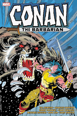
Rant Review: Conan the Barbarian: The Original Marvel Years Omnibus vol 9

I've been buying all of the omnibus collections Marvel has published since reacquiring (and since relinquishing) the Conan license, and enjoyed all of them, to one degree or another. Volume 9 may seem like an odd place to begin reviewing this series, but I've seen very few reviews of this book online, so I figured I'd contribute one to help anyone who may be on the fence about this one to decide whether or not it's worth adding to their collection. 

We're nearly at the finish line, but there's a rather sizeable stumbling block in the way. But just how high is that hurdle? The issues reprinted in this volume have a reputation as the absolute nadir of the entire original Marvel run of Conan, so I was interested to read them for the first time to see just how bad things got. The book is fairly strong as it kicks off, with Val Semeiks continuing his run, now co-plotting with Charles Santino. These stories are all single issue adventures depicting Conan as an unstoppable force, charging ahead relentlessly as he deals with any obstacles in his path in the most direct manner possible. These issues are fast-paced and action-packed, with energetic art by Semeiks and the legendary Alfredo Alcala providing appropriately detailed and hard-edged visuals. My favorites are #215, in which a group of Turanian soldiers very quickly learn the perils of trying to take a Cimmerian captive; #218, which follows Conan's battle for survival on a small island populated by hostile visitors; and #219, which relates Conan's efforts to escape a city on horseback. These stories are fun reads, and very entertaining, but I wouldn't want an extended run of such short, disconnected stories.

Then, we get an extended run of such short, disconnected stories, as the Semeiks/Santino team leave the book, and the editors burn through a bunch of inventory issues. We get stories by Larry Hama, Don Perlin, Michael Fleisher, and Gerry Conway. Most of these are decent stories that neither excel nor offend, though I found Conway's trio of two-parters rather tiresome. Hama's pair of done-in-one stories were probably my favorites from this batch, with "Drum Song," a tale of Conan's pirate days narrated in verse, a particular standout. There is some nice art to be found among these issues, including one fully illustrated by Alcala. Still, I was ready for the series to have some sense of direction again long before I reached the end of these short, mostly single issue tales.

That new direction kicked off in issue #232, and I wanted to slap myself for willingly inflicting this calamity on my battered psyche. "The New Conan," as it was billed, travels to a time prior to the legendary Cimmerian's birth, and covers the years leading up to his Marvel debut back in 1970. Writer Michael Higgins and Jim Lee contribute a very nice cover evoking the beloved BWS style, and the run peaks right there. Bad comics can be fun-- witness the gut-bustingly funny trainwreck of Batman: Odyssey, for example-- but these are just bad in all the right ways to make them painful to slog through. A prime example is their depiction of the siege of Venarium, a legendary event in the Hyborian world, one which showed all of the "civilized" kingdoms that the Cimmerians were NOT TO BE MESSED WITH. Here, it's reduced to a magical mishap in which the Cimmerians are barely a factor. This is emblematic of this run's poor understanding of Conan's world, not to mention the man himself. The first four issues have art by Ron Lim, and his style is really not a good fit for Conan and his world. The art improves after he leaves, particularly with #236's Rodney Ramos/Alfredo Alcala team-up, and we get a couple of very nice covers by Mike Mignola. Even so, these issues are tough to get through. Sales must not have been good, as this "bold new direction" was euthanized by a returning Roy Thomas after just nine issues. He wraps it up and accounts for its various problems in about the best way possible, setting the stage for his series-finale run, collected in the next volume.

There isn't much in the way of bonus material, but that's hardly surprising, so late in the run. The introductions are the main draw on that front, and they offer a few nice tidbits. The intro by Higgins is particularly interesting, revealing some of the thinking behind the "young Conan" run. I recommend this book for big Conan fans, but only if you can get it at a significant discount, or borrow it from your local library. Just be aware going in that you're not getting the series at its best, adjust your expectations accordingly, and you'll find some fun material among the dreck.

I'm currently working my way through volume 10, and enjoying it quite a bit more. I'll probably whip up a review about it as well, once I'm done with it. I may go back and review the earlier volumes, if there's any demand for it. Everyone take care, and I'll see you next time!

Monday, August 28, 2023

The 007 Re-Read Project: For Special Services by John Gardner


Then-new Bond continuation novelist John Gardner's 007 debut, License Renewed, had been a critical and commercial success, and he sought to raise the stakes a bit with his follow-up novel. I remember enjoying this one quite a bit when I read it about 25 years ago, so I was interested to see how it would hold up. Grab hold of your martinis, and let's find out! As ever, I won't blow the entire plot, but there are  

SPOILERS AHEAD!

After assisting the SAS in foiling a string of violent mid-air plane robberies, James Bond finds himself summoned to M's office. He finds M sitting with an attractive young woman who seems oddly familiar. M introduces her as Cedar Leiter, the daughter of his old friend Felix! Flabbergasted, Bond sits to listen to the mission briefing. A scrap of paper found on the body of an FBI agent in the swamps of Louisiana indicates the existence of a resurgent SPECTRE, led by someone calling themselves Blofeld. Bond is sure it can't possibly be his old nemesis Ernst Stavro Blofeld-- with some justification, as even in the often comic book-esque world of 007, Blofeld received just about as definitive a death as possible-- but either way, a revived SPECTRE in any form is a threat to be taken seriously. And Bond, of course, has a personal interest in unmasking this new Blofeld.

The trail leads to Markus Bismaquer, an immensely wealthy (former?) Nazi sympathizer who has built his own private city in the middle of the desert in the American west, complete with a full-scale replica of Tara from Gone with the Wind. The dead FBI agent whose body yielded the SPECTRE clue, along with several other agents, had been sent to investigate suspicious activity at Bismaquer's compound. Bond and Cedar ingratiate themselves with Bismaquer and infiltrate his compound. They meet Bismaquer's wife, Nena, and his Smithers, Walter Luxor. In a shocking turn of events, Nena quickly falls for Bond, and warns him of the imminent danger they face. As for Luxor, Bond quickly begins to suspect that he may actually be the head of SPECTRE, rather than Bismaquer. Bond and Cedar investigate both of their prime suspects, and attempt to uncover SPECTRE's plan, as the rest of SPECTRE's top-level members begin to arrive for a meeting that will surely signal its initiation. And unbeknownst to Bond, Blofeld has reserved a key role in their plot just for him...

 One of the biggest issues with this novel is its pacing. There's a sizeable section early on that sees Bond and Cedar masquerading as a professor and his wife who have uncovered extremely rare prints in a bid to attract Bismaquer's attention. A group of extremely generic thugs hassle them, leading to a tussle and a halfway decent death trap. This entire section of the novel is so inconsequential that it seems to have been included solely to pad out the page count. The prints serve as a method to get into Bismaquer's compound, but that could have been easily achieved without wasting several chapters. Bond's cover identity is so useless that he just ditches it after the second thug attack, and things proceed just fine. At least when Gardner brings the leader of the thugs back later in the novel he serves a more important purpose. 

Once we're in the compound, there's quite a bit of standing around and talking, but there's nearly always a sense of things moving forward. Personally, I found it impossible not to read Bismaquer's dialogue in the voice of the Rich Texan from The Simpsons! Whether that's an asset or a hindrance depends on your own sensibilities. Bismaquer is easily one of the chummiest of Bond villains, and several scenes lend credence to Bond's suspicion that it may be Luxor who is actually leading SPECTRE. Luxor has a pretty interesting appearance and background, and he serves as the antagonist in the novel's best action setpiece. I found the revelation of the new Blofeld pretty satisfying, along with the identity of the person who helped Bond near the novel's end. Both reveals defy expectations in a very interesting manner, though the new Blofeld is sadly dispatched far too abruptly. 

There is one more thing that simply has to be addressed, and that is the character of Cedar Leiter. There's nothing really problematic about the concept itself, though it may age Felix a bit more than many readers would like. The real problem is the constant effort to force a romance between the two, though Bond does vehemently resist it. Still, even though the novel itself acknowledges how inappropriate and downright creepy it would be for Bond to have a sexual fling with the daughter of his best friend, it ends with a situation that seems guaranteed to lead there, anyway. It's nice to see Felix himself appear at the end, but the whole "gift of a daughter" thing is just stomach-churning. Even in 1982, this had to seem pretty fucked up, right?


Notable Quotes:

 "The Silver Beast" was the nickname members of the service had given to Bond's personal car-- the Saab 900 Turbo: his own property, with the special technology built into it at his expense. Jibes about it being Bond's "toy" received only a polite smile from 007; and he knew that Major Boothroyd, the Armourer, had constantly sniffed around the machine in an attempt to discover all its secrets: the hidden compartments, tear gas ducts, and new refinements recently built into the bullet-proofed vehicle. 

(The Silver Beast was a beloved part of the Gardner Bonds, and I love the idea of Q having a bit of professional jealousy over Bond having it modified elsewhere on his own dime!)

___________________________________

   Bond did not blush, even though "gentlemen" was scarcely a word ladies used to describe him. 

___________________________________

 "To be honest with you, Bond... if it wasn't for that predatory Nena woman, I'd put Bismaquer down as a faggot."

"Right the first time," Bond said.

"Lawks-a-mercy." Cedar  gave a satisfied smirk as they turned into Tara's main drive. "I'se sick, Mizz Scarlet, I'se sick." 

(Notable for all the wrong reasons. This one has several layers of "HOLY SHIT!" packed into it. Product of its time, and all that, and people can bitch about things today being "too PC" all they want, but I'm still glad we don't commonly see exchanges like this in our entertainment these days.)

____________________________________


This novel didn't hold up as well as its predecessor, and certainly not to my memories of reading it when I was a teen back in the late '90s, but I did find plenty to enjoy within its pages. The possibility of the Cedar romance is problematic, and I could hardly believe the quote above when I read it, but that is the novel at its absolute worst. You have to keep the context of the time in which the novel was published in mind when you read one of these, and enjoy it based on its merits despite things that stand out in a negative way. Not everyone can do that, and that's okay, but this is definitely one to skip if you can't compartmentalize certain elements of it in that way. If you can, however, give this one a read. The problematic bits don't come close to overwhelming the good bits. It's not one of the best Bonds, but it's well worth a read. It's also worth noting that this new version of SPECTRE does stick around for awhile, so the novel does have a long-term impact on the series. Next time, we'll be looking at another one I remember really enjoying, Icebreaker! Hopefully it'll hold up a bit better. See you then!

Wednesday, August 16, 2023

The 007 Re-Read Project: On His Majesty's Secret Service by Charlie Higson


So... it's been quite a bit longer than the couple of weeks I'd planned for. I won't go into detail, because that's really not what this blog is for, but let's just say that real life got in the way. After losing my dad early last year, in particular, it was pretty difficult to care about things like updating my blog. Recently, however, I've been feeling that itch again, so I'm back to do a bit of scratching. Admittedly, this post is a bit of a cheat, as this book is only a few months old, and I'm reading it for the first time. To help me ease back into the habit, however, I figure it gets a pass. Plus, this'll keep everyone from having to wait years for me to re-read it to give it eligibility! 


Charlie Higson, no stranger to the world of James Bond, was asked to write his first adult 007 novel to compliment the coronation of King Charles III, with the proceeds going to the National Literacy Trust. Bond is put on the tail of Aethelstan of Wessex, a wealthy eccentric who claims to be the true king of England, and aims to disrupt the coronation. Raising the stakes is the discovery of the dead body of 009, who had previously been sent on the same mission. Time is short, and Aethelstan is sure to be on high alert after discovering 009's infiltration of his organization. Bond must contend with a gaggle of wealthy lunatics who have bought into Aethelstan's cause, an army of mercenaries, and the enigmatic Ragnheidur, the requisite femme fatale of the novel. 

The novel is definitely among the shortest Bonds-- Higson was given only three weeks to complete it-- and it feels a bit condensed, as Higson does his best to fit in as many of the expected scenarios as possible. It's still a rather scaled-down adventure compared to what we normally get, and that's not necessarily a bad thing. Most of the characters are rather bland, and the main villain is a particular disappointment, which is surely a consequence of the novel's accelerated creation. Bond himself rings true, which is unsurprising, given Higson's prior experience with the character. (Albeit at a different stage of his life!) Ragnheidur is easily the most memorable supporting character, and I would welcome her presence in a subsequent Bond adventure, however unlikely that seems. The Budapest setting is quite nice, too, though we don't get to spend much time immersed in the local atmosphere before the story becomes barricaded within Aethelstan's castle for much of its length.

As the novel is set in the present day, we have to endure references to social media, and a heaping pile of political discourse. It would be pretty damn tough to avoid politics, given the story's subject matter, but it may be a bit much for some readers, whether or not you agree with the views expressed. I didn't find this detrimental, but if you think it might bother you, be warned! There was an occasional line that just sounded odd, or out of character-- hearing M refer to blogging just doesn't seem right, 2023 setting or not-- though I feel many such idiosyncrasies would likely have been eliminated if the novel had been given more time to gestate. 

Notable quotes:

 Bond didn't like the codewords and acronyms that were increasingly creeping into the MI6 vocabulary. He felt they were designed to soften the reality of what they did. D37. Looked harmless. But it was a desperate thing. An emergency flare. A shout for help. A dying scream for your mother. No content. Just a digital blip that communicates when an agent has important information but knows they won't be able to parachute out with it. 

There was no acknowledgement that the English were outsiders, themselves... Why pick one small point in history? Why not try to put a Celt on the throne? Or go further back and put a Neanderthal there?

Bond hated fighting. If a fight started it meant all else had failed. It was a last resort. Fighting was painful and things got broken. If you did get into a fight, then you had to shut it down as fast as was humanly possible. 

 Working for the service had been the making of him but the ruin of him too. It had left him unfit to do anything else.  

Despite the shortcomings enumerated above-- and I truly do believe that most of them were due to the book being completed so quickly-- OHMSS is an engaging, if quick, read. I enjoyed my brief time with it, and I find myself hoping that Higson gets the go-ahead to write a full-length novel of the adult Bond very soon! That's all for today, but I'll be back soon to dive back into the Gardner Bonds with For Special Services. I won't pretend to know exactly when, but it definitely won't be another 21 month wait!


Sunday, April 24, 2022

Necropost: Ten Books that Changed My Life

Okay, a bit of backstory: On request, I provided my Facebook friends with a list of ten books that have stuck with me. It was an interesting enough exercise, and a long enough post, that I figured an expanded version would make for a good post here. I copy & pasted the list, expanded on it a bit, and resolved to finish it and publish it here later. Well, as sometimes happens, I wound up forgetting about it. A chat with a friend reminded me of it this evening, so I figured I'd dig it up and finish it. The list needs a bit of updating now, but for the sake of finishing what I started nine short years ago, here are ten books that are not necessarily the best I've ever read, but that have stuck with me for one reason or another, presented in no particular order:

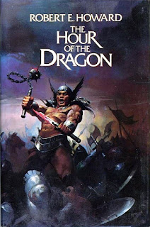
The Hour of the Dragon by Robert E. Howard
This is my favorite REH story ever, and is the only Conan novel written by the character's creator, as well as the only novel REH ever wrote. It's baffling that no one has ever looked to this story when adapting the character and his world to film; it has absolutely everything anyone could want from a Conan story, and it's practically a blueprint for adaptation. (I know, they kinda sorta based that Kull movie on it, but eh... that doesn't count!)

The Godfather by Mario Puzo
This is one of the rare instances where the movie is actually better than the book, but the book itself is no slouch. In addition to the story used for the first Godfather film, it has all the backstory that was used in the second one.

Fahrenheit 451 by Ray Bradbury
This is one of the handful of books that anyone who can read should read, without exception. If you can't read, get someone to read it to you. (Perhaps the same person who is presumably reading this to you?) Is it overrated? Maybe. Regardless, it's still easily one of the most important books ever written.

You Only Live Twice by Ian Fleming
A slightly odd inclusion, as it's not my favorite of Fleming's works, and not even my favorite James Bond novel. (That honor goes to either From Russia, With Love or On Her Majesty's Secret Service.) As the follow-up to the devastating ending of the previous book, however, it has this weirdly fascinating morose tone as it presents Bond as we've never seen him before, and never would again. He stalks his wife's murderer through a Japan populated with ancient castles and bizarre suicide gardens, a shell of his former self who is driven only by a desperate need for vengeance. Not a bit of this, aside from Japan as a location, is in the film that uses the novel's name. It's a book that I'm always interested to re-read because it's so unlike all the other books in the series.

Frankenstein by Mary Shelley
This and the next entry are books I read pretty much back-to-back when I was 12 or so. I was familiar with both stories previously only from movies and comic book adaptations, so it was revelatory to read them in their original forms. They remain books I enjoy re-reading, though Frankenstein is definitely a bit of a slog for the first 100 pages.

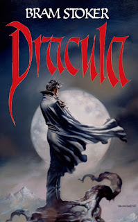
Dracula by Bram Stoker
This novel's epistolary style definitely took me by surprise when I first read it, but it quickly sucked me in. It's definitely not without its flaws, but is compelling reading, regardless. To paraphrase Clive Barker, it's a first-rate 19th century trashy novel! (I managed to find this image featuring the same cover art on the copy I had back when I first read it. Cool, eh?)

Into Thin Air by Jon Krakauer
This is one I picked up due to my fascination with mountaineering. I have no desire to ever actually climb a mountain, and I think I'm probably far too lazy to do it anyway, but I've always been interested in it, for whatever reason. It's the true story of the massive storm that descended on several groups who were climbing Everest in 1997, told firsthand by a journalist who was among them. It's an absolutely harrowing tale, nearly told minute-by-minute, of disaster and tragedy. It's a gut-wrenching read, but so powerful that I've found myself returning to it a couple times all the same. The IMAX documentary "Everest" was being filmed at the same time, and it makes a good companion piece to this book.

Adventures of Sherlock Holmes by Sir Arthur Conan Doyle
This is the first of those stories I ever read, and it remains my go-to when I feel I need a quick Holmes fix. It's a perfect sampler for anyone interested in reading the character's stories.

To Kill a Mockingbird by Harper Lee
Easily one of the most satisfying reads I've ever come across. It may not have actually happened, but it's true, all the same.

The Adventures of Tom Sawyer by Mark Twain
Well, some Twain had to be included, and this was the first of his books that I ever read. It remains possibly my favorite.

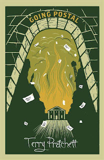
Bonus 2022 addition to the list: Going Postal by Terry Pratchett
I'd need to do a bit more tinkering with the overall list to fully update it to account for the past near-decade, but I absolutely had to add this one. I've been hearing about how wonderful the Discworld series is for many years, and I finally read the first book in the series, The Color of Magic, back in (consults Goodreads) 2011. I liked, but didn't love, the book. I enjoyed it enough that I wanted to read more, but as I often do, I kinda forgot about it for an entire decade. Early last year, something made me think of the series, and I resolved to give it another chance to really hook me. I jumped ahead to one of the most acclaimed books in the series, and damn, did it ever get its hooks in me! It's a fantastic book packed with memorable characters, humor that frequently made me laugh out loud, and a level of depth that repeatedly surprised me. Since finishing it, I've gone back to the beginning, and am currently reading the entire series in publication order. I'm making myself wait at least a couple of weeks between books so I don't blow through them all in a couple of months. I'm a Discworld nut now, and Pratchett has rocketed right into the top tier of my favorite authors, and it all started with this book.

I limited myself to one work by each author, and didn't count short stories. (Although I cheated a bit by including the Sherlock Holmes collection.) So, questions? Comments? Derogatory remarks?

Monday, November 8, 2021

The 007 Re-Read Project: License Renewed by John Gardner


So yeah, that was a bit more than two weeks. I never thought I'd be able to stick to a weekly or bi-weekly schedule indefinitely with this project, as I always have plenty of other books on deck and would need the occasional palette cleanser, at the very least. Beyond that, real life sometimes gets in the way, so there are some weeks where I just don't get to read as much as I'd like. All that said, I really didn't expect it to take me over a month to re-read John Gardner's debut 007 novel! About a third of the way through, I realized I was forcing myself to continue, and I stepped away from it for a few weeks to focus on other things. That's not a condemnation of the novel itself, I just think I'd gotten a bit of Bond book burnout after re-reading the entire Fleming series and the first handful of continuation novels in the span of a couple of months. Returning to the novel after that break, I devoured the remainder of it in short order. 


Gardner's inaugural 007 adventure sees the intrepid agent infiltrating the inner circle of Anton Murik, a brilliant nuclear physicist who lords over the town of Murcaldy, quite literally, as he is its Laird. Murik has hired a dangerous terrorist to further an enigmatic plot that is easily on par with the most apocalyptic Bond villain plans we've ever seen, and it is up to Bond to figure out the Laird's plot, and disrupt it as only he can. Murik himself is an effective villain, with a rather birdlike visage topped by a shock of white hair. From my first readings of the Gardner novels more than twenty years ago, I remember him as one of Gardner's strongest antagonists, but I wouldn't quite rank him in the upper echelon of Bond villains. His right hand man, Caber, makes for a very effective henchman, and his final scene seems to have been influential in one of the major setpieces from the Timothy Dalton film The Living Daylights. Murik's ward Lavender Peacock checks off most of the boxes one expects from one of Bond's leading ladies, and while she tends toward the bland side, her backstory is at least pretty interesting. The story of the Muriks that led to the status quo we see in the novel sound as if it would make for a pretty good novel in its own right! 

When Gardner was hired by Glidrose (now Ian Fleming Publications) to continue the literary adventures of 007, he endeavored to pluck the character from the '60s and drop him right into the (then) modern day, fully intact. (Though he did lower his alcohol and tobacco intake.) For anyone trying to do a version of Bond in the modern day, I think that's the right approach, and Gardner was mostly successful on that front. Gardner made no attempt to emulate Fleming's style; again, I think that was the right call. Gardner was already an accomplished and respected author in his own right, and one author subsuming their own style in an attempt to replicate that of another is rarely something that works well, anyway. Though Bond himself is more or less unchanged, the world has definitely moved forward. The change most relevant to Bond himself is the abolishment of the British Secret Service's 00 section! Thanks to M, however, Bond basically remains a 00 agent in all but official classification: "As far as I'm concerned, 007, you will remain 007...There are moments when this country needs a trouble shooter-- a blunt instrument-- and by heaven, it's going to have one. They can issue their pieces of bumf and abolish the Double-0 section. We can simply change its name. It will now be the Special Section, and you are it." There is also a new face in Q branch, the niece of Major Boothroyd, Q himself. Given the rather cringy nickname Q'ute, she is the main liaison between Bond and Q branch in the novel. Bond's beloved Walther PPK has been withdrawn from use, and has been replaced by the Browning 9mm, occasionally supplemented by the unauthorized Ruger Super Blackhawk .44 Magnum he keeps in a secret compartment in his car. 


Speaking of his car, it's not the Aston Martin or Lotus Esprit that was familiar from the film series, or the Bentley Bond typically drove in the novels. Gardner updated Bond's wheels in the form of a Saab Turbo, outfitted with an array of modifications on his own dime, much to the consternation of Q Branch, who seem to have a bit of professional jealousy over the whole thing. The car's modifications include a digital HUD, bullet-proof glass, self-sealing heavy-duty tires, and reinforced bumpers, among other things. As Gardner states in the acknowledgements, "Everything provided by Q Branch and carried by Bond-- even the modification to Mr. Bond's Saab-- is obtainable on either the open, or clandestine, markets." This grounded approach to Bond's gear is appreciated, particularly given some of the excesses of the films, and even later novels. 

There are some very effective scenes in the novel. The torture scene springs immediately to mind, and the wrestling match between Bond and Caber-- yes, really- is quite engaging, as well. The nighttime escape from Murik's castle is also quite well done, and its denouement hinges on something that occurs earlier in the novel, in a nice call-back. There are definitely a handful of scenes that are rather odd, and some that simply don't work. The chapter that follows Bond on his date with Q'ute features a very bizarre scene that seems very out of place, and really had me wondering exactly what Gardner was going for. It reminds me of the ELO sex scene from the 1979 version of Dracula with how bizarre and out-of-place it seems. The villain having Bond at his mercy, yet failing to kill him outright, is a series trope we're all familiar with, but it's stretched nearly to its breaking point here. Even Bond himself seems completely baffled that Murik hasn't already killed him, at one point! The Laird really starts to come off like a massive dipshit by the end of the novel. Gardner tries to justify Murik's keeping Bond alive, but it gets to the point where it simply wears too thin, and you can overtly feel the hand of the author at work. 


Notable quotes:

Governments could come and go; crises could erupt; inflation may spiral, but-- when in London-- Bond's breakfast routine rarely changed.

With his mane of white hair, against the face in the darkness, the visage took on the appearance of a negative.

There were desperate mental counter-measures to interrogation by drugs, and 007 had been through the whole unpleasant course at what they called the Sadist School near Cambridge.

Bond could smell death-- in his head rather than nostrils.

Murik leaned forward with one of his little pecking movements. Strange, thought Bond, how the man could look so distinguished, with that mane of white hair, yet give the impression of being a bulldog and a bird at the same time.

Murik's eyes again stirred into that unpleasant deep movement-- the deadly molten lava, which seemed to betray a hint of madness. That he was wholly mad, in his genius, Bond did not doubt. Only a maniac would take the kind of risks this small monster was about to embark upon. 

Why Murik had not already killed them was almost beyond Bond's comprehension. 


John Gardner's run as author of the Bond novels can still be rather divisive among fans of the literary 007, but regardless of how the quality may have fluctuated further down the road, License Renewed is a strong debut. There are certainly some aspects that strain credulity a bit, even by Bond standards, a few hokey elements, and a couple of rather bland supporting characters, but there are also some very strong scenes, a well-developed villain, and the excitement of seeing James Bond once again take up arms against some of the worst the world has to offer. Gardner's novels definitely have a different flavor than Fleming's, but that's not necessarily a bad thing, and based on my re-read of this book, I'm looking forward to revisiting the rest of his run. That's it for today, but I'll be back soon with Gardner's second 007 opus, For Special Services. I remember liking that one quite a bit, so here's hoping it holds up well! 

Friday, November 5, 2021

Rant Review: Masters of the Universe Origins Webstor figure

The villain-heavy wave six of Mattel's MOTU Origins line continues its rollout, and we're back to look at another member of Skeletor's crew of cretinous creeps, Webstor! This spider-themed villain-- or as spider-themed as you can get when you're only allowed tooling for a new head, anyway-- debuted in the vintage line's 1984 lineup, and quickly became a fan-favorite. His cool action feature, distinctive midnight blue hue, and decidedly un-spider-like, yet still likeably creepy and monstrous, head sculpt was instantly appealing to the hordes of little boys who made up a large portion of MOTU's fanbase. Like his wave-mate Stinkor, he was sadly absent in the 2002 MOTU line, so we never got a figure of that supremely awesome redesign, but this Origins version aims to recapture the magic of his vintage figure. How does it stack up? Read on...

As is the norm, this is a reused body with a newly-tooled head. It's Skeletor from the neck down, with the same sharply-sculpted details and appealingly exaggerated proportions. The head is excellent, capturing the monstrous head we're familiar with while amplifying such details as the ridges on the sides of his head, and the horns that run down its center. There area pair of tiny indentations, one on either side of the second central "horn," that haven't appeared on any previous Webstor figure. I'm not sure what their purpose is, or if they're intentional. They don't detract from the figure's appearance, in any case. 

Webstor has very few paint apps, but what's here has been applied pretty neatly. The red belt has no slop or overspray at all, and has been applied thickly enough that the underlying black doesn't bleed through. The orange and red on the chest armor are similarly flawless. Things get a bit less ideal on the figure's head, though the issue is lack of coverage, rather than slop. The two large red eyes are fine, but the two tiny eyes and the fangs don't fully cover the sculpted features. Still, they are very neat, and you have to be looking pretty closely to notice the lack of full coverage. It's not ideal, but not a major problem. Webstor has the line's standard articulation, with swivel & hinge shoulders, elbows, wrists, hips, knees, and ankles, swivels at the waist and calves, and a ball-jointed head. As ever, this is a very good articulation model that is lots of fun to play around with, and the parts pop apart at the usual spots for easy swapping, though I recommend heating the elbows, hips, knees, and ankles before popping them apart. 

Webstor's accessories are updated versions of the vintage toy's, as we expect from the Origins line at this point. The rifle is a recolored version of the one we got with Castle Grayskull, appearing here in an eye-catching bright orange. His armor, the only top & bottom-clipped clamshell armor we've gotten in this line so far, is attached to the backpack that contains his signature action feature. Clip the grappling hook onto something, then pull the tab on the other end of the string, and the backpack's interior mechanism propels the figure up the line! It doesn't work as smoothly as the vintage toy's did-- toy companies' inability to properly replicate action features they nailed decades ago is basically a running joke at this point-- but it works well enough to be a fun play feature, even with its occasional hitches and snags. The hook is made from stiff enough plastic that it has no problem staying place without warping. (Anyone who tried to pose their Classics Webstor suspended by his hook will know how frustrating a hook made from pliable plastic can be!) With action features mostly relegated to the higher-priced deluxe line, it's great to see such a thing included on a basic figure! The backpack also has a pair of little hooks, one on each side, to aid in wrapping the string up when it's not in use.

As a fan-favorite villain with a great eye-catching design, Webstor is sure to be a popular figure. After the various issues that plagued his wave-mates, I'm happy to see that this fella suffers from no such problems, and even has a cool action feature, to boot! In a wave with a strong lineup, Webstor might be the best figure of the bunch, so don't sleep on this one! That's it for today, but creep on back next Friday for the next review. Until then, stay safe out there, and happy hunting! 

Friday, October 29, 2021

Rant Review: Masters of the Universe Origins Eternian Goddess figure


One of my earliest memories is looking at the very first MOTU minicomic, He-Man and the Power Sword, in the car on our way home from TG&Y, or possibly Howard's. (I'm not 100% sure which it was, as we frequented both stores in my youngest days.) I had just gotten the last figure the store had, He-Man himself, from the new MOTU line. As I looked at the art in the included storybook, I fixated on this image.

The green woman in the snake armor seemed infinitely cool and mysterious to me, and I wondered when there would be a toy of her. As it turned out, I only had to wait a few decades, as the Classics line delivered one in its first full year, though that figure was sadly compromised by production issues. And now, more than a decade after that, we have one in the style of the vintage toys in the Origins line! Now renamed the Eternian Goddess, she serves as the sole heroic character in wave six. Is she good enough to hold the line on her own, or is this figure saddled with its own equivalent of ECS*? Read on...

It's been awhile since I gushed about the packaging art for this line, as its consistent awesomeness can just be assumed at this point, but this figure features such excellent cardback art that it stands out even in this line! Axel Gimenez has channeled his inner Alcala, delivering a piece of art homaging the climactic scene from He-Man and the Power Sword! Check it out:

The figure's sculpt, unsurprisingly, is 100% reuse from Teela. I would have liked to see a new head here, as the original plan for the Goddess/Sorceress back in the day called for that, but Mattel's gonna Mattel, so what can you do? For those of us who haven't been lucky enough to snag a Teela from the newer production run, there is a vital difference: This figure has the new female knees! These knees look so much better, and correct THE major flaw that female figures in this line suffered from. We have presumably seen the last of the original knees, and that is a very good thing! I'm also glad that the figure is not molded in translucent plastic, as the Classics figure was. While the translucent look was cool, it didn't really make any sense, and I'm glad they went with a simple light green skin tone instead.

The paint apps in this wave seem to be much sloppier overall than previous waves, and that's no different here, unfortunately. There's a general slop and overspray in numerous areas of the figure, with the "belt" and furry parts of the boots as the worst offenders. The fur suffers from overspray, lack of full coverage, and such a thin coat of paint that the underlying red bleeds through in multiple areas. The face is very neat, at least, though that hardly makes up for the relative horror show the rest of the paint apps are. 

The Goddess has the line's standard articulation, with swivel & hinge shoulders, elbows, wrists, hips, knees, and ankles, swivels at the waist and calves, and a ball-jointed head. As ever, this is a very good articulation model that is lots of fun to play around with, and the parts pop apart at the usual spots for easy swapping, though I recommend heating the elbows, hips, knees, and ankles before popping them apart. My figure's right arm refuses to stay in its socket, and tends to fall out whenever you touch it, look at it, breathe near it, or think about it too hard. There's nothing visibly different about it, so I'm not sure what the problem is. The Goddess shares the same trio of accessories that we've seen with Teela, and they all function the same. The shield still has a tendency to fall out of the figure's hands, and the addition of a clip for the forearm would have been most welcome. It would have been nice to get the spear so we could give it to Teela in exchange for her snake staff, but again, Mattel doesn't tend to give us something new if they can avoid it. 

Despite being a 100% recolor of a previously released figure, the Goddess has been a highly anticipated figure for many collectors, myself included. There are a couple of alterations I'd have liked to see, but the figure does work as a simple recolor, and I'm glad to have her in the collection. And hey, no ECS*, so that's always a plus! Unfortunately, the paint apps are among the worst I've seen in the entire line, and on a figure that was so cheap for Mattel to produce, seeing them cut corners so obviously really rankles. Whenever costs are cut on action figures, the quality and quantity of paint apps are the first thing to suffer, and we're really seeing that in action here. I can fix these issues, but the fact is, I shouldn't have to. I still recommend picking up this figure, but just be aware that you'll likely have to either live with sloppy paint apps, or take the time to correct them. Once again, Mattel's cheapness has marred a figure I otherwise really like, and that's becoming a very disturbing trend with this line. That's all for today, but head back over next week for more! Until then, stay safe out there, and happy hunting!

*Exploding Crotch Syndrome, of course!


Tuesday, October 19, 2021

Rant Review: Masterverse Spikor figure (MOTU Revelation series)

The second half of the animated Masters of the Universe Revelation series is still over a month away, but wave two of the tie-in Masterverse line is already beginning to pop up! Thanks to Amazon, I managed to snag my first figure from this wave, Spikor! There's been some grumbling about his appaearance in the line, since he technically doesn't actually appear on the show. It's admittedly a somewhat odd inclusion, especially so early in the line's life, but he's a fan-favorite character with an interesting design, so I can definitely see the reasoning behind having him as part of the line in spiteof that. 

The sculpt shares many parts with He-Man, which should come as no surprise. The head and bracers are new, of course, and the spiky torso is achieved with armor rather than a new torso, a method previously employed with the MOTU Classics version of the character. The bracers are glued in place, which will be annoying to some, but at least it prevents them from sliding off when you're swapping the hands around. (The glue can be removed with a bit of trouble, of course, if one is so inclined.) The head has a great sour expression, similar to the grouchy "I just got up, where's my damn coffee?" expression on his Classics counterpart. The spikes are a bit sharper than I expected, but unlike the Super 7 Filmation Spikor, you couldn't use him to impale your enemies or anything like that. The armor compares favorably with the briefly-seen animated design, though asa result, it features the fewest spikes on any Spikor figure to date. As with He-Man, there's a total lack of texture sculpting on the armor, and while that matches the animated source for this design, there's enough added detail on other parts of the figure that its lack here seems incongruous. With a much greater level of detail on some parts than others, it seems at times that this line's designers don't know exactly what they want it to be. 

Spikor has far fewer paint apps than many of the other figures in this line, almost to the level of simplicity we typically see with the Origins line. What's here is applied neatly, however, including tricky apps such as the yellow eyes and fangs over the dark purple face, with no bleed through of the base color at all. There's a nice metallic dark pink/light purple on the light pink belt's inlay, providing some nice contrast with the largely dark color scheme of the figure. The light grayish-blue matches up pretty well on the armor and bracers, despite the bracers being molded in that color, while those areas of the armor are painted. There's a bit of slop around the fangs, but nothing too bad for a mass-produced toy. 

The articulation for this line continues to be one of its strong points. Spikor  has swivel & hinge shoulders, wrists, hips, and ankles, double elbows and knees, swivels at the boot tops, thighs, waist, and biceps, and a ball-jointed head and torso. The torso's range of motion is restricted quite a lot by the armor, but works normally when it is removed. The hips have the same slotted bar design as the male wave one figures, but it works much more smoothly here. I've put the figure in a variety of poses with the legs splayed out every which way, but I haven't run into any of the issues with the bar getting stuck that I ran into with some of the earlier figures. (Mostly He-Man.) I'd like to see the design team continue to tweak the articulation model here and there, as it's close to Marvel Legends level, the gold standard for mass-produced collector lines. A bit more work, and Masterverse can get there!

Spikor has a nice collection of accessories, as we've come to expect from this line. The thagomizer, pitchfork attachment, a pair of swappable hands, and the aforementioned armor offer a good variety of display options. The pichfork weapon is different from previous iterations, matching its appearance in Revelation. It has some nice sculpted details than have been left unpainted. It can be attached onto either wrist, or eschewed altogether if you want to display him with two hands. The thagomizer has a nice metallic finish, making its bright orange stand out even more on the shelf. The plastic used for it is a bit soft, and mine has already begun to wilt a bit after Spikor was posed waving it over his head for a few days. The armor attaches at the bottom on both sides, and slips on and off easily. 

Though a mildly controversial inclusion so early in the Masterverse line, Spikor is a very solid figure. I consider him a few tweaks away from perfection, as I would like more spikes on his armor, more paint apps, and some more detail in the sculpting, but those are really minor issues. As some of them arise from the figure's adherence to the animated source design, I can hardly fault the figure for that! Spikor is another worthy entry in the Masterverse line, and I'm happy to see a relatively minor character appear so early on. For those who don't have the Classics Spikor, this figure holds even more appeal as a much cheaper alternative! The design sensibility is close enough that he will fit into a Classics display just fine. This is another strong entry in a line I'm enjoying quite a bit, and after the Power Con reveals, I'm even more excited for this line's future! That's it for today, but bash your way back here Friday for the next review! Until then, stay safe out there, and happy hunting!

Friday, October 15, 2021

Rant Review: Masters of the Universe Origins Beast Man figure (Lords of Power)

As we saw a few months ago with Mer-Man, Mattel has released a recolored version of one of the figures from it's hideously expensive 2020 Power Con exclusive set at retail, to the consternation of some, and the delight of many. Personally, I applaud this decision, as it makes a very cool character variation available to a far larger number of people, and the new colors sufficiently distinguish it from the con exclusive. As with that Mer-Man figure, this version of Beast Man is based on the prototype of the figure from the pre-release period when the MOTU line was operating under the Lords of Power name. (For more information, check out the article on the always awesome Battle Ram blog!)

The sculpt shares most of its parts with the wave one Beast Man, unsurprisingly. These furry beast parts work well enough, and also serve to tether this version of the character to the standard version more strongly than all-new parts would. (Not that we were ever gonna get 100% new tooling here, of course, but the point still stands.) I don't think the head captures the look of the prototype as well as Mer-Man's did, but it's pretty close, and it definitely looks good regardless of any minor deviation from the source material. The new forearms work well with the existing pieces, and the spikes that protrude over the hands make for an interesting visual. Unfortunately, those damn smooth feet that look like baby booties were used again, when this figure really needed newly sculpted feet. I've never liked those smooth, featureless feet, yet they keep popping up when damn near anything else would be preferable. Given that Mattel has now sold this figure twice, and that they have at least one upcoming figure that could make use of new multi-toed beast feet, they really should have tooled a new, more appropriate pair here. Once again, Mattel's cheapness holds a figure back from reaching its full potential.

As I've mentioned in my other wave six reviews, paint apps seem much sloppier in this wave, and poor Beasty doesn't escape unscathed, either. The paint apps on the armor are neat with nice, crisp lines, but the head has its share of issues. The light yellow used for the teeth bleeds all onto the black area in the interior of the mouth, but that's not the worst of it. My figure had a big blob of bright orange paint that had been plopped right onto his left eye. There's no orange anywhere on this figure, so Grodd only knows where it came from! I scraped most of it off without much trouble, though I hadn't finished cleaning it off yet when I took the review photos, so traces remain. As for the figure's overall color scheme, the designers went with a dark red for the fur, similar to that seen on one of the character's B-sheet designs. Beast Man has the line's standard articulation, with swivel & hinge shoulders, elbows, wrists, hips, knees, and ankles, swivels at the waist and calves, and a ball-jointed head. As ever, this is a very good articulation model that is lots of fun to play around with, and the parts pop apart at the usual spots for easy swapping, though I recommend heating the elbows, hips, knees, and ankles before popping them apart. My figure's left ankle has a limited range of motion due to a bunch of excess plastic that is wedged into the joint! It'll be easy to trim it off, but there's no way this should have made it past QC!

Beast Man's only accessories are his armor set, but what an armor set it is! There's a big belt, possibly commemorating Beast Man's victory to become world champion of Eternia's jungles, and the large body armor. This piece, with its massive pauldrons and big, curved horns, has a fantastic design, and it does much to make the figure an intimidating presence on the shelf. It would have been nice to get some paint apps here, or even a wash to bring out all the sculpted details, but we all know by now that Origins isn't the line where things like that happen! While the prototype upon which this figure is based wasn't shown with any weapons, it wouldn't have killed them to at least toss in the standard Beast Man whip. 

Despite this figure's shortcomings, it's a very cool addition to the line, and exactly the sort of thing I was hoping to get when the Origins line was announced. I can see many collectors grabbing multiple of this figure to serve as henchman for the standard Beast Man, something I'm tempted to do myself, money and space allowing! It's just a shame that, once again, Mattel's relentless chintziness has held a figure back from being everything it could be. None of the issues I pointed out ruin the figure, but they do take what could have been a fantastic figure, and make it just a pretty cool one. This is still a figure I like quite a bit, so by all means, grab one if you have the chance. Just be aware that there are a few potential problems that may bug you. Of course, we always need to keep in mind that if you give one of these to a kid, though, they won't notice any of that stuff, and will have a blast playing with it! 

Rant Review: Masters of the Universe Origins Stinkor figure


Wave six of Mattel's Masters of the Universe Origins line is popping up across the country, though not in my city, as usual. Thankfully, BBTS has me covered, as the set I had on pre-order with them showed up at my house a couple of days ago. My reviews of that set kick off today with a look at one of the most beloved and infamous figures in all of MOTU, the smelly scoundrel himself, Stinkor! I'll tell you the bad news right off the bat: Stinkor doesn't stink, despite the packages claims to the contrary. Stinkor's package is the only one lacking the little vent at the bottom of the bubble, presumably to prevent the figure's patchouli-infused aroma from escaping, but this was an unnecessary precaution. The figure simply doesn't have his signature smell, and from comments I've seen across the web, none of them do. I'm not sure exactly what went wrong, but it's a shame this figure's key feature is missing. With that unfortunate bit of business out of the way, let's move on...


The sculpt is no surprise for anyone familiar with the character's past plastic incarnations, as he is a recolor of Mer-Man. As ever, the Mer-Man head sculpt is oddly far more appropriate for this furry fiend than for the scaly undersea warlord, though the smooth body and limbs are a bit incongruous. The Classics version of the figure went with the furry body that was originally planned for the figure during the prototype stage, but as Origins nearly always draws inspiration from the vintage toys, the route the designers took here is no surprise. The sculpt works as well for the character as it did in the vintage line's days, and fans of the character will not be disappointed. 


Stinkor traditionally has some of the trickier paint apps in the MOTU range, as the white and red on top of black is notoriously difficult for toy manufacturers to get right. Mattel has applied thick enough coats of white and red to avoid the black bleeding through for the most part, though bleed through is evident in some areas. The right arm on my figure has coats of white paint of varying thickness, and the bleed through is at its worst here. The cut lines are nice and crisp, though the red of the gloves doesn't exactly line up with the sculpted points of the gloves. This detail doesn't really bother me, but your mileage may vary. There's a major color mismatch between the painted red gloves on the forearms and the molded red hands, and that's a much bigger issue. The mismatch looks awful, and once noticed, you can't un-see it. The figure's head has more issues. Mine has a random bit of white paint on one lip, but this is thankfully hidden by the armor in most poses. The eyes are fairly sloppy, with wavy, unclear lines around the rims. The ribbed area around the eyes has not been painted fully, with only a thin white strip around the outer perimeter. This doesn't look inherently bad, but if you're familiar with how Stinkor figures normally look, including the vintage figure from which this one draws its inspiration, it's something you're bound to notice. I was particularly annoyed to see that the white stripe down his back only goes down to the top of the figure's armor! Every prior Stinkor figure has had a white stripe that went most of the way down the figure's back, and this is a distinctive feature of the character and skunks in general. This move reeks of cheapness even beyond Mattel's general M.O. of cost-cutting. None of these paint issues ruin the figure, but they do compromise its look significantly. 


Stinkor sports the articulation model we've become accustomed to with this line, with swivel & hinge shoulders, elbows, wrists, hips, knees, and ankles, swivels at the waist and calves, and a ball-jointed head. As ever, this is a very good articulation model that is lots of fun to play around with, and the parts pop apart at the usual spots for easy swapping, though I recommend heating the elbows, hips, knees, and ankles before popping them apart. Stinkor has his standard pair of accessories, his armor and shield. Both of these parts are traditionally reused, but we're seeing them for the first time in the Origins line. Stinkor's armor is a "pre-use" of Mekaneck's, and his shield is a blue version of the Castle Grayskull weapons rack shield. It was MIA in this line's version of Grayskull, however. It would have been nice to have the tanks that were added to the character's design in the 2002 days as an option here, but let's face it, that was never going to happen in this line. Armor and a shield aren't hugely impressive accessories, but at least both are new to the line, and Stinkor's main weapon is his stench, so he doesn't really have much need for a physical weapon, anyway. This wave's minicomic is also included, and while it's a nice bonus, it seems more than ever that these are simply dashed off  quickly, with little care. Still, I do love the fact that they're included, and I'm sure any kids who may get any of these figures will enjoy them more than the average adult collector! 

It may seem from this review that I dislike this figure, but that's really not the case. I actually like it quite a bit, it's just a shame that Mattel's cost-cutting has unnecessarily compromised its look. I'm not sure what happened with the figure's signature smell, as we were assured that it would be present, and the package even insists that the figure stinks. There may have been a mistake during the production run, or maybe the scent was applied and it simply wore off by the time it reached our shores. Whatever the case, it really sucks that the figure's main feature is simply not present. Stinkor is popular enough that the figure is sure to be a strong seller regardless, and I'm happy to have him in the Origins line. I just wish he wasn't a shadow of what he could, and should, have been. With a price increase incoming, Mattel really needs to be stepping up their game to justify the higher price, rather than doubling down on the cost-cutting. That's it for today, but swing back by next Friday for the next Origins review! Until then, stay safe out there, and happy hunting!